Slow Dancing With Color

Moving out of winter into spring isn’t an overnight event here in Vermont. The transition is a slow roll-out that offers plenty of time to savor the “two steps forward, one step back” nature of spring’s dance of color as it gradually returns to our landscape. Every day there is something else to notice, its discovery made all the more special by a muted backdrop and lack of visual competition.

United

United    ©2020 Elizabeth Fram, Ink and colored pencil on paper, 8.5 x 5.25 inches

Mulling this idea over, as one tends to do while out on a walk, it occurred to me that there is a connection between this slow unfolding of spring and the way my daily drawings are currently evolving.

Blue Curtains

Blue Curtains   ©2020 Elizabeth Fram, Ink and colored pencil on paper, 8.5 x 5.25 inches

The coronavirus may have stymied our weekly life drawing sessions at Maple Corner for the time being, but there are always other options. Lately I’ve been using the Sktchy app for my daily sketchbook practice. And while ordinarily I wouldn’t chose to draw from a photo, it’s surely better than not drawing at all. As with most limitations, it’s best to just look for any advantages and get on with it.

Yellow Shades

Yellow Shades   ©2020 Elizabeth Fram, Ink and colored pencil on paper, 8.5 x 5.25 inches

So, back to how Vermont’s transition to spring might inform my drawings.
First, part of the reason I notice and appreciate the measured changes that arrive as our surroundings reawaken is that I walk the same general route every day with Quinn. In a similar vein, I also tend to make the biggest discoveries in my work through daily repetition. I don’t mean repeating each drawing exactly, but rather echoing the same parameters (coffee cups say, or in this case, head-shot portraits of the same size, all made with ink and colored pencil). In doing so over and over, parallels begin to rise to the surface that, once noticed, plant a seed for how I might play upon and push those ideas further in each new drawing.

Red Glasses

Red Glasses   ©2020 Elizabeth Fram, Ink and colored pencil on paper, 8.5 x 5.25 inches

The second part of this so-called vernal theory is that limited color, thoughtfully placed in tandem with shapes and patterns composed of black marks and cross-hatching, create a sense of energy and interest (at least I think they do) that might be lacking in a work with more extensive and fully fleshed-out color. I can’t shake the idea that often the strongest work is the most concise. (And that’s a great goal for me to be chipping away at, especially in light of how intricate my current stitched piece is).

In Process Barbara

In Process   ©2020 Elizabeth Fram, Stitched-resist dye and embroidery on silk, stitched area approximately 10 x 8 inches.    I still need to try to tone down that bulls-eye circle smack in the middle of her face. Hopefully as I do more to suggest her veil, it will help to solve the issue. I’ll have to keep the lessons from this post in mind, hopefully figuring out a solution without a full cover up.

One of the things I enjoy most about what I do is paying close attention to surrounding details and inferring unexpected connections from them. I can’t think of a better teacher than spring in Vermont to promote the lesson that you can often convey the most by saying the least.

A recent email from our local library reminds me that even though its doors are closed, our librarians are still hard at work offering our community valuable resources, such as virtual programming for all ages. I know that lot of folks are having trouble concentrating on reading at this time, and to some degree I count myself among them. But I’ve been listening to a ton of audio books while stitching and drawing, all coming through my library’s RB Digital platform, and it’s been exactly what I’ve needed.
See what your library has to offer, and say a quiet thank you to Ben Franklin for ensuring we have this resource in times of calm and of crisis.

Conquering Isolation

We’re all adjusting.
It may be grasping at straws, but the upside to the challenge of social distancing and remaining at home is that we’re shouldering this together … and virtual cocktail parties are becoming de rigueur.

Dyed

As I promised last post, the following photos show my progress to date, in living color. This shot is of the piece still folded, pleated, and stitched, fresh from the dye bath.

Whole Cloth

The stitches removed and the piece ironed open, reveals the dyed pattern. Note that the colors lighten significantly as the fabric dries – a point I have to keep in mind while dyeing.

I feel guiltily lucky that my studio is at home so that my work hasn’t been upended or interrupted. It’s made it much easier for me to forge ahead and to more easily distract myself through the inevitable waves of anxiety we all seem to be experiencing to some degree. Nigel Cheney, an artist whose drawings and stitched pieces always surprise and amaze me, wrote recently, “I live a life of near perpetual self-isolation already…”, a fact that is largely true for many of us whose work requires large spans of solitude.

Dyed Stitching

Because the image was stitched with silk thread, it too absorbs the dye with the silk fabric ground, largely obscuring the image from view.

Outline

Selective outlining starts to bring her forward. Varying the line between solid and dashed is a simple but effective way to suggest both depth and translucence.

For the most part, it seems that other artists I speak with aren’t feeling the pinch quite as acutely as those who are usually out and about, interacting with the wider world as a necessary part of their day-to-day. But that isn’t to say we aren’t just as much in need of helpful resources to get us over this hurdle.

Fill-In

As I fill areas in with stitch and work to suggest form, I constantly lean on what I’ve learned, and continue to learn, via cross-hatching in my drawings. Although there are obvious differences, there is also a strong relation between the patterns of marks that build up, whether via thread or ink.

Eyes and Mouth

No question, a corner is turned when the features are fleshed out and color is added. The piece really began to come to life once the irises of the eyes were added.

The arts community is pulling together on many levels, demonstrating that learning and culture refuse to kneel to COVID-19. What follows are some resources that surfaced this week. I hope you’ll find something in this list that’s helpful to you as you cope.

Color

I am working back and forth between the figure and the background and still have a long way to go.

The Vermont Studio Center (grants, emergency funding, online events and discussions) and Vermont Arts Council (general resources for the creative sector) are compiling ongoing lists of resources for artists and writers affected by the coronavirus. Each of these links will take you to those pages.

I’m sure others of you also received an email from Andrew Simonet  of Artists U entitled “Artists, This is What We Train For”. If you didn’t, please follow the link to read what he has to say and then take it to heart. As an artist, you have something unique to offer during times of crisis.
(But that said, don’t let it stress you out. Here’s a humorous response to the currently popular tidbit that Shakespeare wrote King Lear during a time of plague.)

Danny Gregory and Sketchbook Skool are offering a free Coronavirus Creativity Guide, including live drawing sessions every weekday on YouTube and FaceBook.

Urban Sketchers London, who by definition usually draw outside on location, have posted the Thirty Day Indoor Sketch Challenge with 30 proposed prompts. If you’ve been meaning to begin a sketch habit, this a great time to start.

Museums and galleries are closed and observing social distancing, but you can tour some of the world’s most famous museums for free without leaving home. No crowds or inconvenient hours to get in your way.

Alyson Stanfield is adapting her Art Biz Podcast to the current situation with new episodes specifically geared toward helping artists weather the COVID-19 storm. The most recent episode, “Structure Your Days to Be in Control of Your Art Business Now”, discusses adaptable work habits that take into account the challenges that being confined to home may have on your practice.

Need a lift? On his blog Still Learning to See, Photographer John Snell shares his view of the world through stunning photographs and insightful musings. There’s no better time to be reminded of the beauty and wonder that surrounds us each day, while keeping in mind our shared humanity.

And finally, a good book is always a great way to escape the news cycle. I am currently deep in The Golden Thread – How Fabric Changed History by Kassia St. Clair, and am fascinated by the details she unearths about the importance textiles have held throughout history and across cultures.

Please check in to let me know how you’re doing. I’d love to hear what coping mechanisms you’ve put in place and the bright spots you’re discovering along the way. And there’s always the question: what are you reading?

We’re all in this together.
Be well, be smart, and be safe.

What’s Your Story, Morning Glory?

Barbara Van Vlaenderberch had eighteen children. Sadly, that’s pretty much all I know about her.

Hans Memling Barbara Van Vlaederberch

Hans Memling, Portrait of Barbara Van Vlaederberch, c.1482

She was married to Willem Moreel, a man who had been born into a prominent Bruges family and who became a public figure of great wealth and standing in that city, holding numerous powerful positions throughout the second half of the 15th century.
But what is her story?

After Hans Memling

After Hans Memling, ©Elizabeth Fram, Graphite on paper, 11.7 x 8.25 inches

When we were at the Musées Royal des Beaux-Arts in Brussels last fall, Barbara’s portrait caught my eye. It was painted in 1482 by Hans Memling, a prominent painter of the affluent, and hence, one of Bruges’ wealthiest citizens himself.

In progress 1

In progress.     The first steps involve mapping out the image with a water-erasable pen, then outlining with a variety of stitches to suggest depth and translucence.

Zooming in on her facial features, while ignoring her medieval dress and hennin, I see an undeniably contemporary air about her. Unlike many formal devotional portraits, it’s not hard at all to imagine her as a living, breathing individual who will soon get up from her prayer and move away.

In Progress 2

In Progress.     Using both Memling’s portrait (enlarged on my iPad) and my own drawing, stitches mimicking hatch marks lend form and definition to individual features. Exploring with stitch allows me to flex my artistic license and to reach beyond to something that is more than a mere copy.

Copying a masterwork is an opportunity to study it in minute detail, to glean valuable technical lessons and, obviously, to reflect upon its subject. Stitching Barbara Van Vlaenderberch has given me plenty of time to wonder about the life and thoughts of a woman who had the fortitude and physical endurance to carry and give birth to eighteen (!) children. Despite her great wealth, what could it possibly be like to raise a virtual tribe? (It seems those eighteen progeny lived, as evidenced in Memling’s 1484 Moreel Triptych – a work which marks the birth of the family portrait. I can’t help but speculate on how many others didn’t survive). What was her life really like? Was her serene appearance merely a devotional ruse by a painter who knew how to please a wealthy client? Or is it truly a measure of her personality? Perhaps she was just too tired to look anything but calm.

In Progress 3

In Progress.     I’ve learned to space stitches out so that there is room for another layer of stitching to be added after the piece has been dyed. This picture highlights how pattern and texture, two components that are so key to textile work, carry with them a unique sense of visual excitement.

We all hide parts of ourselves from public view.
Now that the initial white-on-white embroidery is finished, over-dyeing the image with a stitched-resist pattern and then drawing it back out with another layer of embroidery will give me an avenue for exploring the notion of what is real and what is a mask.
The bonus, for me, is having a brief chance to recognize Barbara Van Vlaenderberch, a woman we will never know, as an individual.

In Progress 4

In Progress.     The initial layer of stitching is complete. It may be hard to see here, but one detail to note: I used only one strand of thread vs two in an effort to suggest her veil and its translucence. We’ll see if that carries through and what else I may need to do to make that clear after the piece has been dyed.

Stay tuned to my instagram to follow as this piece progresses over the next two weeks.

Feeling cooped up because travel is curtailed by Coronavirus? Strong Sense of Place podcast and website will send you on adventures far and wide, with absolutely no risk of infection.

Keeping Eyes Front

I’m still experiencing a lift from spending the day on February 15th with other members of the Surface Design Association, in conjunction with the opening of Threaded: Contemporary Fiber in New England at the Mosesian Art Center in Watertown, MA. Organized by the MA/RI chapter, the day was a welcome opportunity to network and to meet the artists behind names both familiar and unknown. The program included a panel discussion that covered a broad scope of subjects and numerous issues surrounding the way textile art and artists are navigating and maintaining a foothold within the art world at large. A 20 x 20 PechaKucha consisting of 8 presenters was also included.

Threaded

Left top, bottom, & right: “Espresso and Peanut Butter”, Elizabeth Fram, “Rainbow Baby”, Kara Patrowicz, & “Winter Sea”, Jeanne Sisson

One of those presentations in particular has stayed with me. During her brief address, Stacey Piwinski talked about her experience at the Vermont Studio Center which, in addition to her individual work, included welcoming other artist residents to assist her in creating large-scale weavings. Stacey’s irrepressible warmth and enthusiasm permeated her presentation, making it easy to see why she had no trouble filling the time slots on her volunteer sign-up sheets. Her 20 slides palpably conveyed the fun and humor that everyone shared while working with her on this project.

Maple Leaf

©2020 Elizabeth Fram, approximately 12 x 12 inches, Stitched-resist dye and embroidery on silk. I was invited to exhibit my work at the Vermont Visitor’s Center in Montpelier in October. I have been thinking about compiling a series of pieces that suggest the four seasons. Maple leaves are about as iconic as it gets in representing both Vermont and autumn.

Having created a very large loom by stringing a warp onto nails that were hammered directly into her studio wall, Piwinski and each volunteer would sit side-by-side on stools to weave. The element that most moved me about this collaborative process was her description of how it developed into an opportunity to create community. Stories were shared back and forth with her volunteers, generating a sense of connection between disparate people. With all eyes directed to the work before them, talk flowed and personal links were forged. The resulting weavings became a manifestation of that connection.

Maple Leaf detail

©2020 Elizabeth Fram, detail

This framework reminds me of the wisdom that you have no doubt heard or experienced: one is much more likely to have a meaningful conversation with a teenager while driving in a car, when all eyes are directed forward at the road rather than toward each other. This phenomenon doesn’t have to be isolated to teens, as another artist suggested earlier in the day.

There is a healthy representation of activist artwork in the Threaded exhibition, and talk of the current political climate, paired with the role of politically motivated artwork, was a topic of the panel discussion. Art plays a crucial role in voicing issues, but how can it take the next step, ideally pushing forward beyond solely communicating the problems?

The artist I referred to above has been thinking a great deal about this dilemma. She commented on the strong divide within her state which leans liberal in the urban centers while slanting heavily conservative in the more rural outreaches. The overriding question she poses is how to get those of contradicting convictions to see each other as more than just “the opposite side”.

2 Leaves

©2020  Elizabeth Fram, approx. 12 x 12 inches, Stitched-resist dye and embroidery on silk.    Initially I planned on keeping these pieces small (8×8″), but now I’m wondering about framing them larger, so that the circle/burst of dye is obvious. What do you think?

Her thoughts on trying to bridge the divide circles back to the idea of community while relying on the talking-with-your-teen-in-the-car theory. As a basket-maker, she ponders the possibilities that might arise through workshops purposefully located so as to draw people of differing viewpoints together to learn her art. Practicing the rudimentary process of coiling a basket, attendees would share in the experience of tackling the intricate technicalities of a new skill, with their eyes and concentration centered on their hands and work. Working alongside each other, the playing field is leveled and chances for confrontation might well be lessened. And hopefully, as Stacey Piwinski discovered through her project, a door might slowly open for talk and shared stories, optimally uncovering and highlighting commonalities while potentially chipping away at strongholds of difference.

2 Leaves Detail

©2020 Elizabeth Fram, detail

The thought that has consumed me since the conference is that change begins at the roots, not from lofty heights. And most importantly, we all need to try to promote environments that lay the groundwork for empathy and kindness.  And just perhaps, art is a worthy means for doing that and for taking the next steps.

And for this week’s amusement:

Who’s Manipulating Whom?

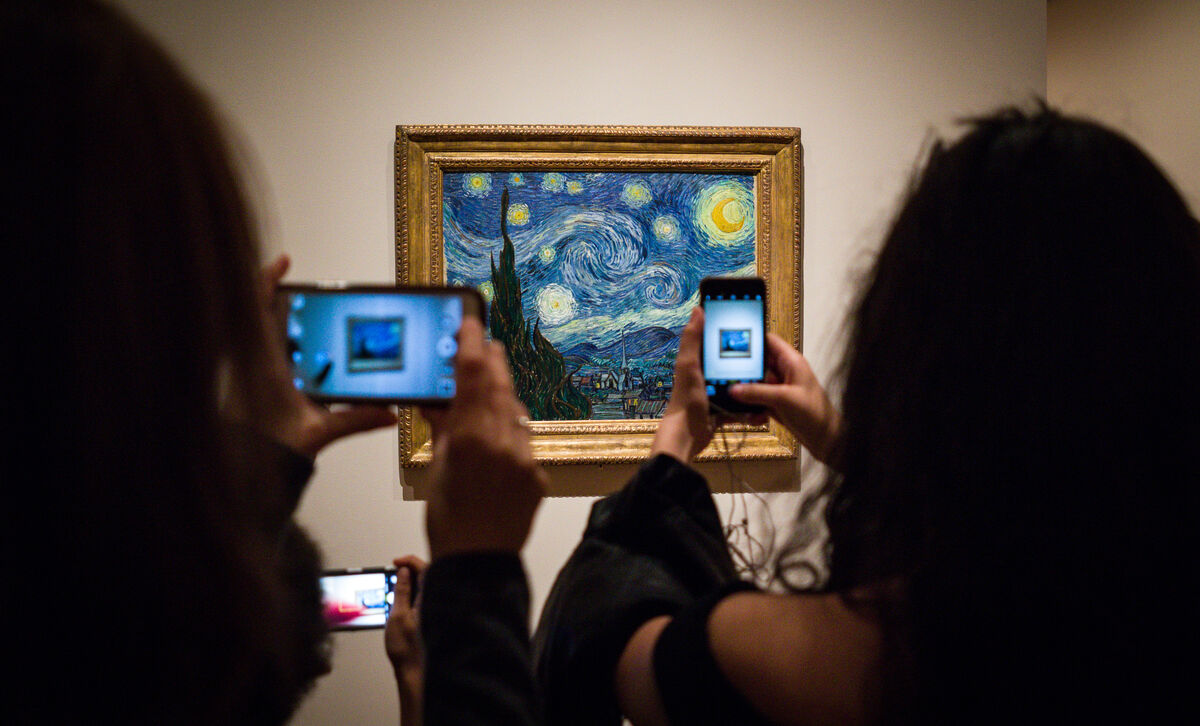
There’s no point in debating whether cell phones are a wonder or a necessary evil; they’re just a fact of life that isn’t going to change. But I will say I admire those who manage to walk the line between taking full advantage of their mobile’s assets while still maintaining the upper hand over it. And I’m even more intrigued when someone figures out how to use the pervasiveness of our phones, and our behavior with them, to artistic benefit.

No question, I count on my phone’s camera when visiting museums and galleries. With the sound and flash off, I can unobtrusively snap a quick photo of a piece and its accompanying ID/info card, allowing me to revisit the work and read more about it later (and of course to have shots to include in this blog).

Photo by Phil Roeder, via Flickr.

Photo by Phil Roeder,  via Flickr,  via artsy.net

But there is definitely a dark side to allowing cell phones and cameras in public art spaces. As you have no doubt experienced, it’s no joy to navigate an obstacle course of selfie-takers, or to thread one’s way through a sea of upraised, photo-taking arms, hoping to enjoy an unobstructed view of an artwork you may well have traveled some distance to experience in person.

Robert Buck iPainting

iPainting (186230889), Robert Buck ©2016 Alert paint and acrylic on canvas  This is the painting as is, the image below includes the flash from my camera.

It’s the very clever artist who acknowledges our penchant for constant documentation, while simultaneously manipulating that tendency in such a way that it enhances not just his art, but the experience of viewing of it. Robert Buck’s iPainting and iPrints at the Helen Day Art Center’s current exhibition Love Letters, are a stunning example. Buck pairs his work with viewer-provided technology (camera flash), intentionally weaving both the art and the picture-snapping viewer together symbiotically. In fact, it is only when the two are integrated that he considers the work fully realized.

Robert Buck iPainting

iPainting (186230889), Robert Buck ©2016 Alert paint and acrylic on canvas             As noted on the gallery card beside the painting: “Buck’s iPaintings are made using a combination of acrylic and Alert paint, an oil-based industrial coating, which, due to an additive of minuscule glass beads, is highly reflective. Consequently, when the painting is illuminated by the flash of a camera, the Alert paint fluoresces and a fallow image appears…the completion of the piece comes in the moment the viewer is photographed in front of the work, thus haloed by the reflective light, becoming universally connected and filled with light.”

Not the greatest fan of cell phones and their interruptions, I find the idea of Buck’s work brilliant. Is it a gimmick? Maybe. But I am reminded of visiting the Uffizi Gallery in 2018. Anxious to get close enough to see and follow Botticelli’s brushstrokes in his monumental Primavera and Birth of Venus, I hung back while group after group took pictures of themselves with the work as their backdrop. I soon realized that it wasn’t so much the work itself that fascinated them, it was the idea of a picture of themselves next to it. With no break in sight, I finally decided to edge my way to the front so I wouldn’t miss an opportunity to see Botticelli’s genius up close. And truthfully, I don’t think my presence made the slightest difference to those whose attention was primarily trained on images of themselves. Imagine, however, if those paintings had somehow been affected as they snapped their pictures. Would such a effect have incurred a fuller sort of engagement? And how would that affect the experience of other nearby viewers?

Buck’s work makes me wonder how other artists will circumvent and/or incorporate technology in such a way that it will no longer be regarded as intrusive in an environment often reserved for meditative contemplation. Never discount the ability of the artistic mind to finding a way to mold reality, for better or for worse, to a higher – or should I say different – purpose.

See more of Robert Buck’s iPaintings.

Food for thought: This article considers how cell phones impact cognition and, more specifically, whether and how they affect one’s appreciation of art. It has some surprising revelations.

Face To Face

January tends to feel more expansive than any other month of the year and thus seems much more open to opportunity. December’s stepped-up pace and the additional chores brought on by the holidays are now behind us, and long snowy days make sticking close to the studio even more attractive than usual. With that in mind, I decided to take an online class this month that revolves around drawing faces. 30 Faces/30 Days, offered by Sktchy, has been a series of daily video lessons from various artists, touching on such subjects as “Capturing Facial Proportions” and “Energizing Your Lines.”

Blind Contour

“Drawing Blind”, one lesson encouraged taking the time to do one – or several – blind contours as a way to warm up before tackling a drawing. It’s such a great exercise that always results in something unique.

Glasses

©2020 Elizabeth Fram, 10 x 6.5 inches, Graphite and colored pencil on paper. This is the more formal rendition of the same image as the contour above.  While I’m not a big proponent of drawing from a photograph, it was necessary for the class and I’ve come to realize there is still much that can be learned from the process.

I’m glad I took the leap. What you see here are a sampling of my results.
Each lesson contained some unexpected, helpful nugget, so that as the month ends I feel I’ve reaped plenty of fresh info to keep in the back of my mind, not just during future life-drawing sessions, but when drawing in general. And who knows how it may surface in my textile work. Probably the most fruitful aspect overall has been the push for regular practice.

Mapping Lights and Darks

©2020 Elizabeth Fram, 10 x 9, Graphite on paper. “Mapping Lights and Darks”

Thinking along this same general theme, the one element of the impeachment trial that I’ve actually enjoyed has been seeing Art Lien’s sketches of the trial itself. The Senate chamber has been swept clean of all cameras other than the one trained on whoever is speaking. Lien, (who usually covers the Supreme Court — no cameras allowed there either) and two other artists were allowed in to give us a chance to see what’s happening around the edges.

Natural Blacks

©2020 Elizabeth Fram, 11 x 7.5, Graphite and colored pencil on paper. “Creating a Natural Black” This lesson stressed that overlapping red, green and blue creates a richer black than black itself.

Lien’s drawings are so much more descriptive than TV. His watchful eye captures personality and individual quirks that we might otherwise never see: the sock-less Senator Burr, the press corps literally sitting on the edges of their seats, Senator Portman’s illegal cell phone, and Mitt Romney’s bottle of chocolate milk that had to be quickly decanted into a glass.

Spotting a Vanishing Point

©2020 Elizabeth Fram, 12 x 9 inces, Graphite on paper. “Spotting a Vanishing Point” — perspective is just as applicable when portraying the structure of a human body as it is for a city street.

For anyone interested in the art of sketching, it’s fascinating to see the depth of information Lien’s deceptively simple lines portray. His work underscores one of the things I love so much about the practice of drawing — by really looking, you catch and solidify details that bring back the richness of an experience long after it has ended.

January Debate

The January 14th Debate gave me a taste of how hard Art Lien’s job really is. Even though I wasn’t seeing the candidates in person, the fact that they were moving added more life than is possible with a still photo. It was an advantage that they each kept returning to the same general position as they talked to the moderators or the camera. These sketches each took several rounds of answers before I could capture the general essence of what I wanted.

Lien is not the only sketch artist in the room. Read this article for a deeper dive into the weeds about the artists covering the trial, including some discussion on the materials they use, etc.

If you happen to be nearby and need a reprieve from the snow and ice, check out the show Botanical Blitz (up through March 7) at Studio Place Arts, 201 N Main St. Barre, VT. It is a vibrant and colorful oasis inspired by plants, animals, and insects – a visual respite from the depth of winter. Read Mary Gow’s review in the Rutland Herald for a taste of what is on view.

June's Trophy

June’s Trophy  ©2019 Elizabeth Fram, 10 x 10 inches, Stitched-resist dye and embroidery on silk. Photo: Paul Rogers Photography


Lessons Learned

These past two weeks I’ve been on a mission to finish up this piece that I’ve been working on since September. With so many other irons in the fire, I haven’t been reporting on its progress regularly, but I’m happy to say I am finally finished and feeling richer for the lessons learned along the way.

First version

The first, and sadly unsuccessful, version of the chess king

To bring you up to speed: The two halves (the king and the queen) were worked separately since the whole piece is larger than the frame I use for stretching cloth while stitching. The king was completed at the end of October, and the queen in the beginning of December. I was not able to see and compare all parts of the piece while working, so it was a bit of an ugly surprise to discover that the king on the left (which had been stitched first and that I was quite satisfied with when completed) just didn’t hold up next to the queen on the right. In fact it seemed to almost disintegrate into its background. So many hours of work! What to do?

Tools of the Trade

Tools of the trade, along with a big pile of removed stitches.

Lesson #1: Take a break. Time away from the studio during the holidays provided the necessary breathing room to figure out a solution to such a discouraging challenge. With fresh eyes, I could easily recognize the hard reality of what was needed to pull the figure out from its background.  Note to self: a hazard of working so closely and in such fine detail is forgetting to get regular distance from the work to be sure it reads as correctly from afar as it does at close range. Always step back mid-process.

Taking out the stitches

Picking out stitches is a painstaking and delicate process, but ultimately worth the time.

The way to fix it lay in two things:
Lesson #2: Contrast. My original intent was to keep the king’s side red – hoping that the threads I chose were dark enough to suggest the black pieces of a chess set. But unfortunately, the colors were so analogous to the background that it just became a muddle. However, even though this iteration didn’t work out in the long run, I made some unrelated but fruitful discoveries along the way that will carry forward into future work…i.e. a benefit of deliberate practice (keep reading).

Completely open

The piece with all the stitches removed except for (look closely) that one red section on the middle-left of the figure. Leaving it in place seemed right.

And Lesson #3: Let go – or “murder your darlings” as advised by Arthur Quiller-Couch.* It seems a no-brainer now that undoing the original, and re-stitching the figure in blue, was the proper answer.

Blue Begun

With this small bit done, I can see I’m on the right track.

In relation to these points, two things come to mind.
First, Austin Kleon wrote a post in 2015 on the relationship between “input” and “output” There are many ways that his theory can be stretched to serve whatever issues may currently challenge you in the studio, but I think the most cogent point is that we need to continually feed ourselves with input in order to strengthen our output. Answers lurk in unexpected places.

Blue Finished

Blue king, finished

White Queen

Its partner, the white queen

And secondly, with that fact in mind the other idea that has resonated for me as I’ve been working my way past this particularly sticky wicket comes from the book Talent is Overrated, one of my best picks from 2019.
In it, Geoff Colvin outlines the importance of “deliberate practice” as a necessary ingredient in the success of any professional standout. He discusses exactly what that means and how it is applicable before, after, and during the work itself. “Meta-cognition” is the fancy term he gives to the art of close self-observation while one works, identifying it as the path to pushing oneself forward. Discoveries are sometimes serendipitous, as written in Making it Work, but I think repetition through practice (as I have seen by completely reworking this chess king) remains the gold standard.

House Divided

House Divided (Mitch & Nancy), ©2020 Elizabeth Fram, 18 x 24 inches, Stitched-resist dye and embroidery on silk.    Granted, this is a working photo, but boy does it point out how important it is to hire a professional to capture the best image (shout-out to Paul Rogers Photography). Even so, you get the idea.  A bit of back-story on the chess pieces: They are part of a wooden set I discovered a number of years ago that belonged to my grandfather. He died when I was very young, so I have limited memories of him. Lovely (to my eye), while a bit crudely made, I took a lot of photos at the time, finding the shapes and their shadows quite intriguing.

It isn’t enough to capture a likeness or create a pleasing image. We need to continually study, not just others’ work to try to figure out why they made the choices they did and how it added to their success, but it’s important to apply equal curiosity to our own thought processes and decisions along the way. Think of it as another route to learning the necessary lessons that ultimately elevate our individual output.

Threads of Truth

If you will be in Chicago in the next weeks, consider a trip to the Zhou B Art Center to see Threads of Truth, curated by Sergio Gomez. My piece “Hell Freezes Over” will be among the work in the exhibition.

Hell Freezes Over

Hell Freezes Over ©2016 Elizabeth Fram, 12 x 12 inches, Stitched-resist dye and embroidery on silk

Finally, three resources for your listening pleasure:

Margaret Sheridan and Louise Fletcher of the Art Juice podcast ask and discuss the important question How Do You Define Success?.

And, since most of us can’t get to Berkeley, CA very easily, check out Slow Fiber Studios’ podcasts recorded from their lecture and event series.  Among other things, the topics covered include natural dyes and textile conservation by some of the world’s top experts.

*Check out Darlingside, who coined their name from Queller-Couch’s quote. For wonderful music to work by, filled lush melodies and superpower harmonies, give a listen.

Flipping Pages

I love all the reading lists that surface from various sources throughout December. It’s been a happy and productive reading year for me too, so I’m joining the crowd and sharing my top picks from 2019. Some are art-y, a few are business/tech-related, and the rest are just good, solid stories for the dark evenings ahead.

But before we get started, a bit of housekeeping… 

For those of you who are also signed up to receive my periodic newsletter, I understand some may have mistaken the year-end issue (sent out several days ago) for this week’s blog post, creating confusion as to why Eye of the Needle came out early. So much for “branding” and trying to keep the look of my various missives on point! In the future I think I will probably change the banner at the top of the newsletter to avoid confusion. Please keep in mind that the newsletter will only appear 3 to 4 times a year, so if you’re interested in short, specific announcements with additional tidbits, please subscribe here.

The other announcement I have to share is that after much thought this past month, I have decided to cut back to posting Eye of the Needle every other week. Going forward, I hope that approach will keep it fresh for both you and for me.

Okay, on to the books! Let me know if any of the below become a favorite for you in 2020. And I’m always eager to hear what books you loved last year.


Old In Art School: A Memoir of Starting Over

Old in Art School, Nell Painter.   A memoir by a lauded historian who decided to go to art school at the age of 64. A wonderful exploration of her experiences as she achieves her BFA & MFA.


Devotion (Why I Write)

Devotion, Patti Smith.   A haunting tale of obsession and a glimpse into Patti Smith’s writing process. It’s a wonderful follow up to Painter’s book.
(If you’d like to know more, these first two books resonated so strongly with me that I wrote a mini book report about them last January.)


The One-in-a-Million Boy

The One-in-a-Million Boy, Monica Wood.   A tale of unlikely, yet deep friendship and discovery between a Boy Scout (and eventually his parents) and 104 year old Ona Vickuss.


Plainsong

Plainsong, Kent Haruf.   The story of a pregnant girl, a lonely teacher, a pair of boys abandoned by their mother, and two crusty bachelor farmers — all healing their wounds and finding community in each other.


Pitch Perfect: How to Say It Right the First Time, Every Time Hardcover – April 1, 2014

Pitch Perfect : how to Say it Right the First Time, Every Time, Bill McGowan.   Tips and pointers on how to give the best presentations and responses in all manner of situations. If, like me, public speaking doesn’t come easily for you, this book is a wonder that will give you the confidence to do a good job – and even enjoy the process.


41558631. sx318

Handywoman, Kate Davies.   How Davies found recovery and revelation in knitting, design, and community after suffering a stroke at age 36. I wrote about this one too.


Beartown: A Novel

Beartown, Fredrik Backman.   A wonderful, beautifully written, character-driven book! Gut-wrenching, and at times humorous, it speaks to the good and bad of human nature. Especially resonant in the regard to the Kavanaugh hearings. Probably one of my all-time favorites.


Harry's Trees: A Novel

Harry’s Trees, Jon Cohen. This one had a big build-up from one of my favorite podcasts What Should I Read Next, & it didn’t disappoint. Great story, well-paced. Perfect read when looking to get lost but not necessarily escape.


Digital Minimalism: Choosing a Focused Life in a Noisy World

Digital Minimalism: Choosing a Focused Life in a Noisy World, Cal Newport.   A roadmap for being released from screens and to regaining power over our time and attention.


[By Sarah Winman ] Tin Man: A Novel (Hardcover)【2018】 by Sarah Winman (Author) (Hardcover)

Tin Man, Sarah Winman.   Beautiful and sparse. Emotionally true through place and circumstance. A tale of souls holding each other up, each finding refuge in the other. It details separation and togetherness, and the power of place to heal.


The Hate U Give

The Hate U Give, Angie Thomas.  Perhaps you saw the movie? Even if you did, consider revisiting this – especially the audio version. A mere moment changes protagonist Star Carter’s life forever. Such an important read. Narrator: Bahni Turpin was fantastic!


Talent is Overrated: What Really Separates World-Class Performers from Everybody Else

Talent is Overrated, Geoff Colvin. A study of first-rate achievers, highlighting that passionate effort is the powerful ingredient behind great success, and how “deliberate practice”, more than talent, figures into the equation.


The Subtle Art of Not Giving a F*ck: A Counterintuitive Approach to Living a Good Life

The Subtle Art of Not Giving a F*ck, Mark Manson.   One of the wisest books I’ve ever read – packed with a fabulous perspective on dealing with life. Applicable on many levels. Truly terrific.


Seasoned in Vermont

Seasoned in Vermont, Marguerite Hurrey Wolf. I found this at the library book sale and it’s a keeper. A pleasant, gentle recap of the months and seasons of a Vermont year within the author’s life. Conveys a wonderful sense of place that anyone who lives here will recognize.

See you in two weeks!

Looking Forward

There’s something reassuring in the artificial markers of Labor Day and New Year’s Day. While in reality nothing really changes, I think it’s both hopeful and invigorating to feel as though a fresh page has been turned.

Sara

Wings, ©2019 Elizabeth Fram, 18 x 24 inches, Graphite and colored pencil on paper

The cusp of 2020 offers a sense of liberation in looking forward, in imagining possibilities that lie ahead, and in letting go just enough to let the unexpected unfold.

Emma

Emma, ©2019 Elizabeth Fram, 24 x 18 inches, Graphite on paper

My June 2018 post Welcoming Possibility speaks to the idea that being open to unplanned hurdles and riding out their change of direction often yields a better result than if everything had proceeded as originally planned.
Here’s hoping you find that strategy works for you too.

Happy New Year!

Second Time Around

Considering all the disfunction in Washington and its impact on our relationships abroad, it’s heartening to know that there are elements of our government that are concentrating on supporting positivity.  Art is a link that bridges divides between cultures while also celebrating their similarities. The US State Department’s Art in Embassies program is an entity that works successfully toward just that end.

A couple of weeks ago I received the very welcome honor/request that I loan another of my pieces through Art in Embassies, this time to Patrick Murphy, the new US ambassador to Cambodia. The piece he chose will hang within his residence for the length of his tour in Phnom Penh. It was an added delight when the curator shared with me that Ambassador Murphy is a Vermonter and wanted to showcase artists from his home state.

Passages, One

Passages, One ©2006 Elizabeth Fram, 32 x 33 inches, Hand-dye and hand-stitching on cotton and silk

My previous post The Universal Language, touches on the idea of art as a means of bringing countries together. If you’re looking for some uplifting holiday down-time, follow the links within it to the PBS series Craft in America which has two fabulous episodes you can stream online, highlighting the ongoing cultural exchange between the US and Mexico. The post also shares further information about the Art in Embassies program, an opportunity I would encourage all US artists to explore.

And speaking of Craft in America, if you’re a shibori fan, tune in on December 27th (check your local PBS listings) to see Judith Content discuss her work in the episode Craft in America: Quilts.

Merry Christmas and Happy Hanukkah!