Category Archives: Textiles and Drawings

Who’s Manipulating Whom?

There’s no point in debating whether cell phones are a wonder or a necessary evil; they’re just a fact of life that isn’t going to change. But I will say I admire those who manage to walk the line between taking full advantage of their mobile’s assets while still maintaining the upper hand over it. And I’m even more intrigued when someone figures out how to use the pervasiveness of our phones, and our behavior with them, to artistic benefit.

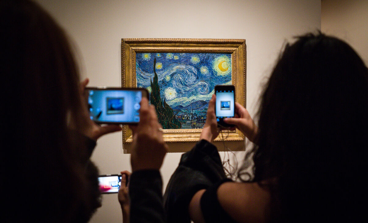
No question, I count on my phone’s camera when visiting museums and galleries. With the sound and flash off, I can unobtrusively snap a quick photo of a piece and its accompanying ID/info card, allowing me to revisit the work and read more about it later (and of course to have shots to include in this blog).

Photo by Phil Roeder, via Flickr.

Photo by Phil Roeder,  via Flickr,  via artsy.net

But there is definitely a dark side to allowing cell phones and cameras in public art spaces. As you have no doubt experienced, it’s no joy to navigate an obstacle course of selfie-takers, or to thread one’s way through a sea of upraised, photo-taking arms, hoping to enjoy an unobstructed view of an artwork you may well have traveled some distance to experience in person.

Robert Buck iPainting

iPainting (186230889), Robert Buck ©2016 Alert paint and acrylic on canvas  This is the painting as is, the image below includes the flash from my camera.

It’s the very clever artist who acknowledges our penchant for constant documentation, while simultaneously manipulating that tendency in such a way that it enhances not just his art, but the experience of viewing of it. Robert Buck’s iPainting and iPrints at the Helen Day Art Center’s current exhibition Love Letters, are a stunning example. Buck pairs his work with viewer-provided technology (camera flash), intentionally weaving both the art and the picture-snapping viewer together symbiotically. In fact, it is only when the two are integrated that he considers the work fully realized.

Robert Buck iPainting

iPainting (186230889), Robert Buck ©2016 Alert paint and acrylic on canvas             As noted on the gallery card beside the painting: “Buck’s iPaintings are made using a combination of acrylic and Alert paint, an oil-based industrial coating, which, due to an additive of minuscule glass beads, is highly reflective. Consequently, when the painting is illuminated by the flash of a camera, the Alert paint fluoresces and a fallow image appears…the completion of the piece comes in the moment the viewer is photographed in front of the work, thus haloed by the reflective light, becoming universally connected and filled with light.”

Not the greatest fan of cell phones and their interruptions, I find the idea of Buck’s work brilliant. Is it a gimmick? Maybe. But I am reminded of visiting the Uffizi Gallery in 2018. Anxious to get close enough to see and follow Botticelli’s brushstrokes in his monumental Primavera and Birth of Venus, I hung back while group after group took pictures of themselves with the work as their backdrop. I soon realized that it wasn’t so much the work itself that fascinated them, it was the idea of a picture of themselves next to it. With no break in sight, I finally decided to edge my way to the front so I wouldn’t miss an opportunity to see Botticelli’s genius up close. And truthfully, I don’t think my presence made the slightest difference to those whose attention was primarily trained on images of themselves. Imagine, however, if those paintings had somehow been affected as they snapped their pictures. Would such a effect have incurred a fuller sort of engagement? And how would that affect the experience of other nearby viewers?

Buck’s work makes me wonder how other artists will circumvent and/or incorporate technology in such a way that it will no longer be regarded as intrusive in an environment often reserved for meditative contemplation. Never discount the ability of the artistic mind to finding a way to mold reality, for better or for worse, to a higher – or should I say different – purpose.

See more of Robert Buck’s iPaintings.

Food for thought: This article considers how cell phones impact cognition and, more specifically, whether and how they affect one’s appreciation of art. It has some surprising revelations.

Face To Face

January tends to feel more expansive than any other month of the year and thus seems much more open to opportunity. December’s stepped-up pace and the additional chores brought on by the holidays are now behind us, and long snowy days make sticking close to the studio even more attractive than usual. With that in mind, I decided to take an online class this month that revolves around drawing faces. 30 Faces/30 Days, offered by Sktchy, has been a series of daily video lessons from various artists, touching on such subjects as “Capturing Facial Proportions” and “Energizing Your Lines.”

Blind Contour

“Drawing Blind”, one lesson encouraged taking the time to do one – or several – blind contours as a way to warm up before tackling a drawing. It’s such a great exercise that always results in something unique.

Glasses

©2020 Elizabeth Fram, 10 x 6.5 inches, Graphite and colored pencil on paper. This is the more formal rendition of the same image as the contour above.  While I’m not a big proponent of drawing from a photograph, it was necessary for the class and I’ve come to realize there is still much that can be learned from the process.

I’m glad I took the leap. What you see here are a sampling of my results.
Each lesson contained some unexpected, helpful nugget, so that as the month ends I feel I’ve reaped plenty of fresh info to keep in the back of my mind, not just during future life-drawing sessions, but when drawing in general. And who knows how it may surface in my textile work. Probably the most fruitful aspect overall has been the push for regular practice.

Mapping Lights and Darks

©2020 Elizabeth Fram, 10 x 9, Graphite on paper. “Mapping Lights and Darks”

Thinking along this same general theme, the one element of the impeachment trial that I’ve actually enjoyed has been seeing Art Lien’s sketches of the trial itself. The Senate chamber has been swept clean of all cameras other than the one trained on whoever is speaking. Lien, (who usually covers the Supreme Court — no cameras allowed there either) and two other artists were allowed in to give us a chance to see what’s happening around the edges.

Natural Blacks

©2020 Elizabeth Fram, 11 x 7.5, Graphite and colored pencil on paper. “Creating a Natural Black” This lesson stressed that overlapping red, green and blue creates a richer black than black itself.

Lien’s drawings are so much more descriptive than TV. His watchful eye captures personality and individual quirks that we might otherwise never see: the sock-less Senator Burr, the press corps literally sitting on the edges of their seats, Senator Portman’s illegal cell phone, and Mitt Romney’s bottle of chocolate milk that had to be quickly decanted into a glass.

Spotting a Vanishing Point

©2020 Elizabeth Fram, 12 x 9 inces, Graphite on paper. “Spotting a Vanishing Point” — perspective is just as applicable when portraying the structure of a human body as it is for a city street.

For anyone interested in the art of sketching, it’s fascinating to see the depth of information Lien’s deceptively simple lines portray. His work underscores one of the things I love so much about the practice of drawing — by really looking, you catch and solidify details that bring back the richness of an experience long after it has ended.

January Debate

The January 14th Debate gave me a taste of how hard Art Lien’s job really is. Even though I wasn’t seeing the candidates in person, the fact that they were moving added more life than is possible with a still photo. It was an advantage that they each kept returning to the same general position as they talked to the moderators or the camera. These sketches each took several rounds of answers before I could capture the general essence of what I wanted.

Lien is not the only sketch artist in the room. Read this article for a deeper dive into the weeds about the artists covering the trial, including some discussion on the materials they use, etc.

If you happen to be nearby and need a reprieve from the snow and ice, check out the show Botanical Blitz (up through March 7) at Studio Place Arts, 201 N Main St. Barre, VT. It is a vibrant and colorful oasis inspired by plants, animals, and insects – a visual respite from the depth of winter. Read Mary Gow’s review in the Rutland Herald for a taste of what is on view.

June's Trophy

June’s Trophy  ©2019 Elizabeth Fram, 10 x 10 inches, Stitched-resist dye and embroidery on silk. Photo: Paul Rogers Photography


Lessons Learned

These past two weeks I’ve been on a mission to finish up this piece that I’ve been working on since September. With so many other irons in the fire, I haven’t been reporting on its progress regularly, but I’m happy to say I am finally finished and feeling richer for the lessons learned along the way.

First version

The first, and sadly unsuccessful, version of the chess king

To bring you up to speed: The two halves (the king and the queen) were worked separately since the whole piece is larger than the frame I use for stretching cloth while stitching. The king was completed at the end of October, and the queen in the beginning of December. I was not able to see and compare all parts of the piece while working, so it was a bit of an ugly surprise to discover that the king on the left (which had been stitched first and that I was quite satisfied with when completed) just didn’t hold up next to the queen on the right. In fact it seemed to almost disintegrate into its background. So many hours of work! What to do?

Tools of the Trade

Tools of the trade, along with a big pile of removed stitches.

Lesson #1: Take a break. Time away from the studio during the holidays provided the necessary breathing room to figure out a solution to such a discouraging challenge. With fresh eyes, I could easily recognize the hard reality of what was needed to pull the figure out from its background.  Note to self: a hazard of working so closely and in such fine detail is forgetting to get regular distance from the work to be sure it reads as correctly from afar as it does at close range. Always step back mid-process.

Taking out the stitches

Picking out stitches is a painstaking and delicate process, but ultimately worth the time.

The way to fix it lay in two things:
Lesson #2: Contrast. My original intent was to keep the king’s side red – hoping that the threads I chose were dark enough to suggest the black pieces of a chess set. But unfortunately, the colors were so analogous to the background that it just became a muddle. However, even though this iteration didn’t work out in the long run, I made some unrelated but fruitful discoveries along the way that will carry forward into future work…i.e. a benefit of deliberate practice (keep reading).

Completely open

The piece with all the stitches removed except for (look closely) that one red section on the middle-left of the figure. Leaving it in place seemed right.

And Lesson #3: Let go – or “murder your darlings” as advised by Arthur Quiller-Couch.* It seems a no-brainer now that undoing the original, and re-stitching the figure in blue, was the proper answer.

Blue Begun

With this small bit done, I can see I’m on the right track.

In relation to these points, two things come to mind.
First, Austin Kleon wrote a post in 2015 on the relationship between “input” and “output” There are many ways that his theory can be stretched to serve whatever issues may currently challenge you in the studio, but I think the most cogent point is that we need to continually feed ourselves with input in order to strengthen our output. Answers lurk in unexpected places.

Blue Finished

Blue king, finished

White Queen

Its partner, the white queen

And secondly, with that fact in mind the other idea that has resonated for me as I’ve been working my way past this particularly sticky wicket comes from the book Talent is Overrated, one of my best picks from 2019.
In it, Geoff Colvin outlines the importance of “deliberate practice” as a necessary ingredient in the success of any professional standout. He discusses exactly what that means and how it is applicable before, after, and during the work itself. “Meta-cognition” is the fancy term he gives to the art of close self-observation while one works, identifying it as the path to pushing oneself forward. Discoveries are sometimes serendipitous, as written in Making it Work, but I think repetition through practice (as I have seen by completely reworking this chess king) remains the gold standard.

House Divided

House Divided (Mitch & Nancy), ©2020 Elizabeth Fram, 18 x 24 inches, Stitched-resist dye and embroidery on silk.    Granted, this is a working photo, but boy does it point out how important it is to hire a professional to capture the best image (shout-out to Paul Rogers Photography). Even so, you get the idea.  A bit of back-story on the chess pieces: They are part of a wooden set I discovered a number of years ago that belonged to my grandfather. He died when I was very young, so I have limited memories of him. Lovely (to my eye), while a bit crudely made, I took a lot of photos at the time, finding the shapes and their shadows quite intriguing.

It isn’t enough to capture a likeness or create a pleasing image. We need to continually study, not just others’ work to try to figure out why they made the choices they did and how it added to their success, but it’s important to apply equal curiosity to our own thought processes and decisions along the way. Think of it as another route to learning the necessary lessons that ultimately elevate our individual output.

Threads of Truth

If you will be in Chicago in the next weeks, consider a trip to the Zhou B Art Center to see Threads of Truth, curated by Sergio Gomez. My piece “Hell Freezes Over” will be among the work in the exhibition.

Hell Freezes Over

Hell Freezes Over ©2016 Elizabeth Fram, 12 x 12 inches, Stitched-resist dye and embroidery on silk

Finally, three resources for your listening pleasure:

Margaret Sheridan and Louise Fletcher of the Art Juice podcast ask and discuss the important question How Do You Define Success?.

And, since most of us can’t get to Berkeley, CA very easily, check out Slow Fiber Studios’ podcasts recorded from their lecture and event series.  Among other things, the topics covered include natural dyes and textile conservation by some of the world’s top experts.

*Check out Darlingside, who coined their name from Queller-Couch’s quote. For wonderful music to work by, filled lush melodies and superpower harmonies, give a listen.

Flipping Pages

I love all the reading lists that surface from various sources throughout December. It’s been a happy and productive reading year for me too, so I’m joining the crowd and sharing my top picks from 2019. Some are art-y, a few are business/tech-related, and the rest are just good, solid stories for the dark evenings ahead.

But before we get started, a bit of housekeeping… 

For those of you who are also signed up to receive my periodic newsletter, I understand some may have mistaken the year-end issue (sent out several days ago) for this week’s blog post, creating confusion as to why Eye of the Needle came out early. So much for “branding” and trying to keep the look of my various missives on point! In the future I think I will probably change the banner at the top of the newsletter to avoid confusion. Please keep in mind that the newsletter will only appear 3 to 4 times a year, so if you’re interested in short, specific announcements with additional tidbits, please subscribe here.

The other announcement I have to share is that after much thought this past month, I have decided to cut back to posting Eye of the Needle every other week. Going forward, I hope that approach will keep it fresh for both you and for me.

Okay, on to the books! Let me know if any of the below become a favorite for you in 2020. And I’m always eager to hear what books you loved last year.


Old In Art School: A Memoir of Starting Over

Old in Art School, Nell Painter.   A memoir by a lauded historian who decided to go to art school at the age of 64. A wonderful exploration of her experiences as she achieves her BFA & MFA.


Devotion (Why I Write)

Devotion, Patti Smith.   A haunting tale of obsession and a glimpse into Patti Smith’s writing process. It’s a wonderful follow up to Painter’s book.
(If you’d like to know more, these first two books resonated so strongly with me that I wrote a mini book report about them last January.)


The One-in-a-Million Boy

The One-in-a-Million Boy, Monica Wood.   A tale of unlikely, yet deep friendship and discovery between a Boy Scout (and eventually his parents) and 104 year old Ona Vickuss.


Plainsong

Plainsong, Kent Haruf.   The story of a pregnant girl, a lonely teacher, a pair of boys abandoned by their mother, and two crusty bachelor farmers — all healing their wounds and finding community in each other.


Pitch Perfect: How to Say It Right the First Time, Every Time Hardcover – April 1, 2014

Pitch Perfect : how to Say it Right the First Time, Every Time, Bill McGowan.   Tips and pointers on how to give the best presentations and responses in all manner of situations. If, like me, public speaking doesn’t come easily for you, this book is a wonder that will give you the confidence to do a good job – and even enjoy the process.


41558631. sx318

Handywoman, Kate Davies.   How Davies found recovery and revelation in knitting, design, and community after suffering a stroke at age 36. I wrote about this one too.


Beartown: A Novel

Beartown, Fredrik Backman.   A wonderful, beautifully written, character-driven book! Gut-wrenching, and at times humorous, it speaks to the good and bad of human nature. Especially resonant in the regard to the Kavanaugh hearings. Probably one of my all-time favorites.


Harry's Trees: A Novel

Harry’s Trees, Jon Cohen. This one had a big build-up from one of my favorite podcasts What Should I Read Next, & it didn’t disappoint. Great story, well-paced. Perfect read when looking to get lost but not necessarily escape.


Digital Minimalism: Choosing a Focused Life in a Noisy World

Digital Minimalism: Choosing a Focused Life in a Noisy World, Cal Newport.   A roadmap for being released from screens and to regaining power over our time and attention.


[By Sarah Winman ] Tin Man: A Novel (Hardcover)【2018】 by Sarah Winman (Author) (Hardcover)

Tin Man, Sarah Winman.   Beautiful and sparse. Emotionally true through place and circumstance. A tale of souls holding each other up, each finding refuge in the other. It details separation and togetherness, and the power of place to heal.


The Hate U Give

The Hate U Give, Angie Thomas.  Perhaps you saw the movie? Even if you did, consider revisiting this – especially the audio version. A mere moment changes protagonist Star Carter’s life forever. Such an important read. Narrator: Bahni Turpin was fantastic!


Talent is Overrated: What Really Separates World-Class Performers from Everybody Else

Talent is Overrated, Geoff Colvin. A study of first-rate achievers, highlighting that passionate effort is the powerful ingredient behind great success, and how “deliberate practice”, more than talent, figures into the equation.


The Subtle Art of Not Giving a F*ck: A Counterintuitive Approach to Living a Good Life

The Subtle Art of Not Giving a F*ck, Mark Manson.   One of the wisest books I’ve ever read – packed with a fabulous perspective on dealing with life. Applicable on many levels. Truly terrific.


Seasoned in Vermont

Seasoned in Vermont, Marguerite Hurrey Wolf. I found this at the library book sale and it’s a keeper. A pleasant, gentle recap of the months and seasons of a Vermont year within the author’s life. Conveys a wonderful sense of place that anyone who lives here will recognize.

See you in two weeks!

Second Time Around

Considering all the disfunction in Washington and its impact on our relationships abroad, it’s heartening to know that there are elements of our government that are concentrating on supporting positivity.  Art is a link that bridges divides between cultures while also celebrating their similarities. The US State Department’s Art in Embassies program is an entity that works successfully toward just that end.

A couple of weeks ago I received the very welcome honor/request that I loan another of my pieces through Art in Embassies, this time to Patrick Murphy, the new US ambassador to Cambodia. The piece he chose will hang within his residence for the length of his tour in Phnom Penh. It was an added delight when the curator shared with me that Ambassador Murphy is a Vermonter and wanted to showcase artists from his home state.

Passages, One

Passages, One ©2006 Elizabeth Fram, 32 x 33 inches, Hand-dye and hand-stitching on cotton and silk

My previous post The Universal Language, touches on the idea of art as a means of bringing countries together. If you’re looking for some uplifting holiday down-time, follow the links within it to the PBS series Craft in America which has two fabulous episodes you can stream online, highlighting the ongoing cultural exchange between the US and Mexico. The post also shares further information about the Art in Embassies program, an opportunity I would encourage all US artists to explore.

And speaking of Craft in America, if you’re a shibori fan, tune in on December 27th (check your local PBS listings) to see Judith Content discuss her work in the episode Craft in America: Quilts.

Merry Christmas and Happy Hanukkah!

Clearing The Decks

When I look back through the last 5 years of December posts, I can see a slow progression toward coming to grips with the fact that, due to all the extra chores surrounding the holidays, this has evolved into a month of reflection, reassessment, and planning ahead rather than business-as-usual production. And maybe that isn’t such a bad thing.
My 2017 post Don’t Forget to Check Your Rearview is a jumping-off point for how you might do the same.

Before

Before

After weeks of juggling various projects, I finally devoted a full day last weekend to clearing the decks throughout my studio — a big job, but one that will help this coming January get off to an efficient start. It wasn’t until after I’d had my purge-and-organize session that I discovered Alyson Stanfield’s lastest Art Biz podcast with Fiona Valentine: 5 Simple Steps to an Organized Studio. If a studio clear-out is coming up on your calendar, give this a listen, keeping in mind Fiona’s counsel that a messy studio costs you time, money and productivity.

After

After

After, 2

It may not look it, but this is an “after” shot too.


Value(able) Lesson

Important lesson from this week: color is flexible, but value needs to remain constant.

KnightLeft

©2019 Elizabeth Fram

Problem:
How to convey two objects that are the same color, ostensibly sitting under the same light source, but depicted on backgrounds that are entirely different from each other in both color and saturation.
The best answer seems to lie in value. Look closely at the similarities and differences of these two knights to see what I mean. The highlight color is constant, but the shadow colors are not: shades of mauve and purple in the knight facing right, slate blue and navy in the knight facing left. Yet the overall impression of both is the same.

Knight Right

©2019 Elizabeth Fram

My January 2016 post, Benefiting from the Basics, points out how trimming back to thinking only in terms of value (while painting a monochromatic watercolor sketch) revealed an unexpected and beneficial parallel with my textile work, one that I continue to think about and use today.

Knights Together

©2019 Elizabeth Fram

As Carol Marine says in Chapter 4 of her book Daily Painting, “If you have the values down, the world will be your oyster”.

Ok, I admit it, this is more than just a link to an archived post. Old habits die hard, but it’s a start. The good news is that I saved hours this week, all of which have been devoted to stitching (and making discoveries about value).

5 Candles

I’m trying to wrap my brain around the fact that this marks my 260th post and the close of five years of faithfully writing and posting to Eye of the Needle every single week since November 29, 2014. A huge shoutout to my son who encouraged me to take the leap; I’m not sure I would have ventured into the blogosphere without his gentle nudge.

Queen 1

© Elizabeth Fram    Work in progress: Tracking the second half of my double-arched piece

If you’ve ever toyed with the idea of starting a blog about your art, or even some sort of writing practice, consider these benefits:

  • Practicing anything leads to improvement, and writing regularly has taught me an immeasurable amount about expressing my ideas — both on paper and verbally. And perhaps even more importantly, it has helped me appreciate ruthless editing.
  • Those who tout the advantages of writing about one’s art aren’t kidding — it really does improve the ability to pin down and coherently articulate your process and the ideas behind your work. This is key when talking to others, especially if what you make isn’t as readily understood as the art of an oil painter or a stone sculptor.
  • Writing impels one to structure and organize a thesis, a potentially tall order for those of us who think visually. Writing helps solidify the bigger picture (idea) behind your art, making the tricky decisions about which direction to take next, if not clear, much easier.
  • Without this blog I wouldn’t have discovered a fraction of the interesting artists, books, articles, and general information about art that I share. My research has led to a feeling of connection with the art world and its larger community.
  • Eye of the Needle has also created a sense of personal camaraderie. Your comments are always welcome and much appreciated. I thoroughly enjoy reading/hearing about your experiences and recommendations.
  • And finally, I never dreamed how much I would enjoy the process of writing (and rewriting) itself. Reading what writers say about their own art helpfully overlaps with other creative processes. Books like Stephen King’s On Writing, Anne Lamott’s Bird by Bird, and Eric Maisel’s A Writer’s Paris have provided info and ideas that have bled across disciplines into my own practice.

But (isn’t there always a but?) that said, I have had to come to grips with the huge amount of time (on average 8 hours per week) this commitment demands. I’d like to spend more hours drawing and on my textile work, neither of which could be considered particularly “speedy” activities. So I’ve decided to make some gentle changes. The transition will be a work in progress; please bear with me.

Queen 2

© Elizabeth Fram

I am going to take the month of December off from writing but will still be uploading links to one post from my archives each week. If you’re anything like me, it may be as though you’re reading it for the first time. 😊 I will still leave the door open to the possibility of sharing  information I may come across in my reading that I think might be of interest or of help to you.
All of which means you will still be getting your regular Friday email from me.

Queen 3

©Elizabeth Fram    Next step: planning how to attack to smaller pieces flanking the queen while balancing all with the other side. It looks a little wonky now, but we’ll see what happens.

When January rolls around, I’m hoping to have a clearer idea of how to proceed. It’s likely I will trim back to 2 written posts per month, while keeping you abreast of my drawings and textile work as they unfold. We’ll see.

As I post this on Thanksgiving Day, it seems particularly appropriate to say thanks so much for being here up to this point, and I hope you will stick with me as Eye of the Needle moves forward.

Downeast Alchemist

Don’t you love it when you come across the unexpected?

When visiting the Farnsworth Museum in Rockland, Maine last month, the last gallery I walked through held a wonderful surprise. As something of a temple to Maine art, artists, and the state itself, the Farnsworth is filled with works that express a love for the landscape, seascapes, people, and industry that make Maine the special place it is. For the most part, I would say the collection spans the early 19th century to the late 20th. In such a relatively traditional environment, happening upon Brian White’s piece Rose Arbor / Sea Street was a refreshing anomaly.

Brian White Rose Arbor / Sea Street

Rose Arbor / Sea Street, Brian White, 2006, Welded copper tubing, shells, Gaufrage velvet

Unquestionably, White’s piece is a confection; a dress formed of metal, covered in roses and leaves that one soon realizes are made of thousands of tiny shells. The work communicates beauty and strength, two characteristics that one might also associate with Maine.  I tend to be attracted to work where the materials don’t necessarily jive with what is being portrayed, thus nudging the imagination via unexpected parallels. Take a look at Fraser Smith’s wood carved “textiles” for another example of this approach.

The gallery card adjacent to the work says of White: “his distinctive body of work reflects his sensitivity to materials and at the same time pays homage to the memory of people and events past and present, often referencing the sea”. I searched for more information on him and discovered very little. But check out John Ames “Frog Pond Journal” blog and the Peabody Essex Museum site to see others of his imaginative pieces and to gain a glimpse into White’s world.

Brian White, detail

Rose Arbor / Sea Street, detail

Having grown up on the Maine coast and logged my fair share of solitary hours on a rocky beach, I found depths to this piece beyond the obvious use of unexpected found materials. It shot me back through time, allowing me to indulge memories of childhood imaginary worlds created out of tide pool treasures and detritus washed up on the shore. What a gift of connection that is.

Read Paula Crown’s article Thinking Like an Artist – Translating Ideas into Form while keeping White’s work in the back of your mind as context. Both left me with an appreciation of the broad alchemy of art-making and how it shapes our world.

Living Color

If you had to choose one thing to work on for the next 6 months to a year, what would it be?

Nathan

Nathan ©2019 Elizabeth Fram, 22.25 x 18.25 inches, Graphite and colored pencil on paper

I’m still chipping away at my 2019 goal to incorporate more color in my life drawings.
Generally, what I think most about when drawing is line, so I’ve been using hatching to follow through on that plan. However, the more drawings I get under my belt, the more I see a glimmer of where further practice may lead.

Thaya Detail

Thaya, detail ©2019 Elizabeth Fram, Graphite and colored pencil on paper

Thaya

Thaya, cropped ©2019 Elizabeth Fram, 18 x 22.25 inches, Graphite and colored pencil on paper

The following quote pretty well encapsulates what pulls me into any drawing in the first place while outlining a worthy quality to strive for in 2020.

A line is a visual trail of energy that has been drawn across a surface, and is a manifestation of the life energy of the person that made it.     ~Mick Maslen*

Rather than switching gears next year, I’m planning to build on the steps I’ve taken so far, while also working toward stronger color and deeper values. My experimentation with varying papers has shown me how much they contribute to the crispness and clarity of both line and color.

Lisette

Lisette, detail ©2019 Elizabeth Fram, 18.25 x 24.5 inches, Graphite and colored pencil on paper

*I was interested in learning more about Mick Maslen since I wasn’t at all familiar with his name. Turns out he is a UK artist who taught drawing and painting for many years before retiring from teaching in 2008.

Through the wonder of the internet, I also learned he was a contributor to The Guardian newspaper’s 2009 Free Guide to Drawing, a treasure trove of interviews and tutorials with leading contemporary artists. Check it out! He, together with Jack Southern, wrote the book The Drawing Projects: An Exploration of the Language of Drawing, a major publication on contemporary drawing practice and theory. Boy, would I love to get my hands on a copy of that (!) – but an extensive search revealed it seems to be either out of stock or available at a too steep price. I will have to keep my eyes peeled for a copy in used bookstores — which may be a challenge outside the UK.

If you’re interested in using learning more about colored pencils, this is a good place to start. The number of options may make your head spin, but it’s worth wading through the info to see what’s best for you.

Caran D'Ache Pablo

I started out with Prismacolor Verithin because I was drawing on vellum and wanted a pencil that was hard and would keep a strong point. But their colors are limited, and since I was moving to other surfaces, I bought a set of Caran D’Ache Pablo which are reasonably priced while giving me the most bang-for-my-buck, color-wise.  The Caran D’Ache are much creamier and blend well, allowing for a strong build-up of color. The Verithin are best for seeing individual lines as you layer colors over each other, so I tend to use them in my life drawings where I want to see the hatching. They each react differently depending on the paper used, so lots of experimentation is worth the time.

Verithin