Category Archives: Discussion

Keeping Eyes Front

I’m still experiencing a lift from spending the day on February 15th with other members of the Surface Design Association, in conjunction with the opening of Threaded: Contemporary Fiber in New England at the Mosesian Art Center in Watertown, MA. Organized by the MA/RI chapter, the day was a welcome opportunity to network and to meet the artists behind names both familiar and unknown. The program included a panel discussion that covered a broad scope of subjects and numerous issues surrounding the way textile art and artists are navigating and maintaining a foothold within the art world at large. A 20 x 20 PechaKucha consisting of 8 presenters was also included.

Threaded

Left top, bottom, & right: “Espresso and Peanut Butter”, Elizabeth Fram, “Rainbow Baby”, Kara Patrowicz, & “Winter Sea”, Jeanne Sisson

One of those presentations in particular has stayed with me. During her brief address, Stacey Piwinski talked about her experience at the Vermont Studio Center which, in addition to her individual work, included welcoming other artist residents to assist her in creating large-scale weavings. Stacey’s irrepressible warmth and enthusiasm permeated her presentation, making it easy to see why she had no trouble filling the time slots on her volunteer sign-up sheets. Her 20 slides palpably conveyed the fun and humor that everyone shared while working with her on this project.

Maple Leaf

©2020 Elizabeth Fram, approximately 12 x 12 inches, Stitched-resist dye and embroidery on silk. I was invited to exhibit my work at the Vermont Visitor’s Center in Montpelier in October. I have been thinking about compiling a series of pieces that suggest the four seasons. Maple leaves are about as iconic as it gets in representing both Vermont and autumn.

Having created a very large loom by stringing a warp onto nails that were hammered directly into her studio wall, Piwinski and each volunteer would sit side-by-side on stools to weave. The element that most moved me about this collaborative process was her description of how it developed into an opportunity to create community. Stories were shared back and forth with her volunteers, generating a sense of connection between disparate people. With all eyes directed to the work before them, talk flowed and personal links were forged. The resulting weavings became a manifestation of that connection.

Maple Leaf detail

©2020 Elizabeth Fram, detail

This framework reminds me of the wisdom that you have no doubt heard or experienced: one is much more likely to have a meaningful conversation with a teenager while driving in a car, when all eyes are directed forward at the road rather than toward each other. This phenomenon doesn’t have to be isolated to teens, as another artist suggested earlier in the day.

There is a healthy representation of activist artwork in the Threaded exhibition, and talk of the current political climate, paired with the role of politically motivated artwork, was a topic of the panel discussion. Art plays a crucial role in voicing issues, but how can it take the next step, ideally pushing forward beyond solely communicating the problems?

The artist I referred to above has been thinking a great deal about this dilemma. She commented on the strong divide within her state which leans liberal in the urban centers while slanting heavily conservative in the more rural outreaches. The overriding question she poses is how to get those of contradicting convictions to see each other as more than just “the opposite side”.

2 Leaves

©2020  Elizabeth Fram, approx. 12 x 12 inches, Stitched-resist dye and embroidery on silk.    Initially I planned on keeping these pieces small (8×8″), but now I’m wondering about framing them larger, so that the circle/burst of dye is obvious. What do you think?

Her thoughts on trying to bridge the divide circles back to the idea of community while relying on the talking-with-your-teen-in-the-car theory. As a basket-maker, she ponders the possibilities that might arise through workshops purposefully located so as to draw people of differing viewpoints together to learn her art. Practicing the rudimentary process of coiling a basket, attendees would share in the experience of tackling the intricate technicalities of a new skill, with their eyes and concentration centered on their hands and work. Working alongside each other, the playing field is leveled and chances for confrontation might well be lessened. And hopefully, as Stacey Piwinski discovered through her project, a door might slowly open for talk and shared stories, optimally uncovering and highlighting commonalities while potentially chipping away at strongholds of difference.

2 Leaves Detail

©2020 Elizabeth Fram, detail

The thought that has consumed me since the conference is that change begins at the roots, not from lofty heights. And most importantly, we all need to try to promote environments that lay the groundwork for empathy and kindness.  And just perhaps, art is a worthy means for doing that and for taking the next steps.

And for this week’s amusement:

Who’s Manipulating Whom?

There’s no point in debating whether cell phones are a wonder or a necessary evil; they’re just a fact of life that isn’t going to change. But I will say I admire those who manage to walk the line between taking full advantage of their mobile’s assets while still maintaining the upper hand over it. And I’m even more intrigued when someone figures out how to use the pervasiveness of our phones, and our behavior with them, to artistic benefit.

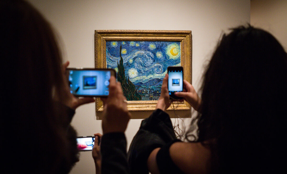
No question, I count on my phone’s camera when visiting museums and galleries. With the sound and flash off, I can unobtrusively snap a quick photo of a piece and its accompanying ID/info card, allowing me to revisit the work and read more about it later (and of course to have shots to include in this blog).

Photo by Phil Roeder, via Flickr.

Photo by Phil Roeder,  via Flickr,  via artsy.net

But there is definitely a dark side to allowing cell phones and cameras in public art spaces. As you have no doubt experienced, it’s no joy to navigate an obstacle course of selfie-takers, or to thread one’s way through a sea of upraised, photo-taking arms, hoping to enjoy an unobstructed view of an artwork you may well have traveled some distance to experience in person.

Robert Buck iPainting

iPainting (186230889), Robert Buck ©2016 Alert paint and acrylic on canvas  This is the painting as is, the image below includes the flash from my camera.

It’s the very clever artist who acknowledges our penchant for constant documentation, while simultaneously manipulating that tendency in such a way that it enhances not just his art, but the experience of viewing of it. Robert Buck’s iPainting and iPrints at the Helen Day Art Center’s current exhibition Love Letters, are a stunning example. Buck pairs his work with viewer-provided technology (camera flash), intentionally weaving both the art and the picture-snapping viewer together symbiotically. In fact, it is only when the two are integrated that he considers the work fully realized.

Robert Buck iPainting

iPainting (186230889), Robert Buck ©2016 Alert paint and acrylic on canvas             As noted on the gallery card beside the painting: “Buck’s iPaintings are made using a combination of acrylic and Alert paint, an oil-based industrial coating, which, due to an additive of minuscule glass beads, is highly reflective. Consequently, when the painting is illuminated by the flash of a camera, the Alert paint fluoresces and a fallow image appears…the completion of the piece comes in the moment the viewer is photographed in front of the work, thus haloed by the reflective light, becoming universally connected and filled with light.”

Not the greatest fan of cell phones and their interruptions, I find the idea of Buck’s work brilliant. Is it a gimmick? Maybe. But I am reminded of visiting the Uffizi Gallery in 2018. Anxious to get close enough to see and follow Botticelli’s brushstrokes in his monumental Primavera and Birth of Venus, I hung back while group after group took pictures of themselves with the work as their backdrop. I soon realized that it wasn’t so much the work itself that fascinated them, it was the idea of a picture of themselves next to it. With no break in sight, I finally decided to edge my way to the front so I wouldn’t miss an opportunity to see Botticelli’s genius up close. And truthfully, I don’t think my presence made the slightest difference to those whose attention was primarily trained on images of themselves. Imagine, however, if those paintings had somehow been affected as they snapped their pictures. Would such a effect have incurred a fuller sort of engagement? And how would that affect the experience of other nearby viewers?

Buck’s work makes me wonder how other artists will circumvent and/or incorporate technology in such a way that it will no longer be regarded as intrusive in an environment often reserved for meditative contemplation. Never discount the ability of the artistic mind to finding a way to mold reality, for better or for worse, to a higher – or should I say different – purpose.

See more of Robert Buck’s iPaintings.

Food for thought: This article considers how cell phones impact cognition and, more specifically, whether and how they affect one’s appreciation of art. It has some surprising revelations.

Lessons Learned

These past two weeks I’ve been on a mission to finish up this piece that I’ve been working on since September. With so many other irons in the fire, I haven’t been reporting on its progress regularly, but I’m happy to say I am finally finished and feeling richer for the lessons learned along the way.

First version

The first, and sadly unsuccessful, version of the chess king

To bring you up to speed: The two halves (the king and the queen) were worked separately since the whole piece is larger than the frame I use for stretching cloth while stitching. The king was completed at the end of October, and the queen in the beginning of December. I was not able to see and compare all parts of the piece while working, so it was a bit of an ugly surprise to discover that the king on the left (which had been stitched first and that I was quite satisfied with when completed) just didn’t hold up next to the queen on the right. In fact it seemed to almost disintegrate into its background. So many hours of work! What to do?

Tools of the Trade

Tools of the trade, along with a big pile of removed stitches.

Lesson #1: Take a break. Time away from the studio during the holidays provided the necessary breathing room to figure out a solution to such a discouraging challenge. With fresh eyes, I could easily recognize the hard reality of what was needed to pull the figure out from its background.  Note to self: a hazard of working so closely and in such fine detail is forgetting to get regular distance from the work to be sure it reads as correctly from afar as it does at close range. Always step back mid-process.

Taking out the stitches

Picking out stitches is a painstaking and delicate process, but ultimately worth the time.

The way to fix it lay in two things:
Lesson #2: Contrast. My original intent was to keep the king’s side red – hoping that the threads I chose were dark enough to suggest the black pieces of a chess set. But unfortunately, the colors were so analogous to the background that it just became a muddle. However, even though this iteration didn’t work out in the long run, I made some unrelated but fruitful discoveries along the way that will carry forward into future work…i.e. a benefit of deliberate practice (keep reading).

Completely open

The piece with all the stitches removed except for (look closely) that one red section on the middle-left of the figure. Leaving it in place seemed right.

And Lesson #3: Let go – or “murder your darlings” as advised by Arthur Quiller-Couch.* It seems a no-brainer now that undoing the original, and re-stitching the figure in blue, was the proper answer.

Blue Begun

With this small bit done, I can see I’m on the right track.

In relation to these points, two things come to mind.
First, Austin Kleon wrote a post in 2015 on the relationship between “input” and “output” There are many ways that his theory can be stretched to serve whatever issues may currently challenge you in the studio, but I think the most cogent point is that we need to continually feed ourselves with input in order to strengthen our output. Answers lurk in unexpected places.

Blue Finished

Blue king, finished

White Queen

Its partner, the white queen

And secondly, with that fact in mind the other idea that has resonated for me as I’ve been working my way past this particularly sticky wicket comes from the book Talent is Overrated, one of my best picks from 2019.
In it, Geoff Colvin outlines the importance of “deliberate practice” as a necessary ingredient in the success of any professional standout. He discusses exactly what that means and how it is applicable before, after, and during the work itself. “Meta-cognition” is the fancy term he gives to the art of close self-observation while one works, identifying it as the path to pushing oneself forward. Discoveries are sometimes serendipitous, as written in Making it Work, but I think repetition through practice (as I have seen by completely reworking this chess king) remains the gold standard.

House Divided

House Divided (Mitch & Nancy), ©2020 Elizabeth Fram, 18 x 24 inches, Stitched-resist dye and embroidery on silk.    Granted, this is a working photo, but boy does it point out how important it is to hire a professional to capture the best image (shout-out to Paul Rogers Photography). Even so, you get the idea.  A bit of back-story on the chess pieces: They are part of a wooden set I discovered a number of years ago that belonged to my grandfather. He died when I was very young, so I have limited memories of him. Lovely (to my eye), while a bit crudely made, I took a lot of photos at the time, finding the shapes and their shadows quite intriguing.

It isn’t enough to capture a likeness or create a pleasing image. We need to continually study, not just others’ work to try to figure out why they made the choices they did and how it added to their success, but it’s important to apply equal curiosity to our own thought processes and decisions along the way. Think of it as another route to learning the necessary lessons that ultimately elevate our individual output.

Threads of Truth

If you will be in Chicago in the next weeks, consider a trip to the Zhou B Art Center to see Threads of Truth, curated by Sergio Gomez. My piece “Hell Freezes Over” will be among the work in the exhibition.

Hell Freezes Over

Hell Freezes Over ©2016 Elizabeth Fram, 12 x 12 inches, Stitched-resist dye and embroidery on silk

Finally, three resources for your listening pleasure:

Margaret Sheridan and Louise Fletcher of the Art Juice podcast ask and discuss the important question How Do You Define Success?.

And, since most of us can’t get to Berkeley, CA very easily, check out Slow Fiber Studios’ podcasts recorded from their lecture and event series.  Among other things, the topics covered include natural dyes and textile conservation by some of the world’s top experts.

*Check out Darlingside, who coined their name from Queller-Couch’s quote. For wonderful music to work by, filled lush melodies and superpower harmonies, give a listen.

Looking Forward

There’s something reassuring in the artificial markers of Labor Day and New Year’s Day. While in reality nothing really changes, I think it’s both hopeful and invigorating to feel as though a fresh page has been turned.

Sara

Wings, ©2019 Elizabeth Fram, 18 x 24 inches, Graphite and colored pencil on paper

The cusp of 2020 offers a sense of liberation in looking forward, in imagining possibilities that lie ahead, and in letting go just enough to let the unexpected unfold.

Emma

Emma, ©2019 Elizabeth Fram, 24 x 18 inches, Graphite on paper

My June 2018 post Welcoming Possibility speaks to the idea that being open to unplanned hurdles and riding out their change of direction often yields a better result than if everything had proceeded as originally planned.
Here’s hoping you find that strategy works for you too.

Happy New Year!

Value(able) Lesson

Important lesson from this week: color is flexible, but value needs to remain constant.

KnightLeft

©2019 Elizabeth Fram

Problem:
How to convey two objects that are the same color, ostensibly sitting under the same light source, but depicted on backgrounds that are entirely different from each other in both color and saturation.
The best answer seems to lie in value. Look closely at the similarities and differences of these two knights to see what I mean. The highlight color is constant, but the shadow colors are not: shades of mauve and purple in the knight facing right, slate blue and navy in the knight facing left. Yet the overall impression of both is the same.

Knight Right

©2019 Elizabeth Fram

My January 2016 post, Benefiting from the Basics, points out how trimming back to thinking only in terms of value (while painting a monochromatic watercolor sketch) revealed an unexpected and beneficial parallel with my textile work, one that I continue to think about and use today.

Knights Together

©2019 Elizabeth Fram

As Carol Marine says in Chapter 4 of her book Daily Painting, “If you have the values down, the world will be your oyster”.

Ok, I admit it, this is more than just a link to an archived post. Old habits die hard, but it’s a start. The good news is that I saved hours this week, all of which have been devoted to stitching (and making discoveries about value).

5 Candles

I’m trying to wrap my brain around the fact that this marks my 260th post and the close of five years of faithfully writing and posting to Eye of the Needle every single week since November 29, 2014. A huge shoutout to my son who encouraged me to take the leap; I’m not sure I would have ventured into the blogosphere without his gentle nudge.

Queen 1

© Elizabeth Fram    Work in progress: Tracking the second half of my double-arched piece

If you’ve ever toyed with the idea of starting a blog about your art, or even some sort of writing practice, consider these benefits:

  • Practicing anything leads to improvement, and writing regularly has taught me an immeasurable amount about expressing my ideas — both on paper and verbally. And perhaps even more importantly, it has helped me appreciate ruthless editing.
  • Those who tout the advantages of writing about one’s art aren’t kidding — it really does improve the ability to pin down and coherently articulate your process and the ideas behind your work. This is key when talking to others, especially if what you make isn’t as readily understood as the art of an oil painter or a stone sculptor.
  • Writing impels one to structure and organize a thesis, a potentially tall order for those of us who think visually. Writing helps solidify the bigger picture (idea) behind your art, making the tricky decisions about which direction to take next, if not clear, much easier.
  • Without this blog I wouldn’t have discovered a fraction of the interesting artists, books, articles, and general information about art that I share. My research has led to a feeling of connection with the art world and its larger community.
  • Eye of the Needle has also created a sense of personal camaraderie. Your comments are always welcome and much appreciated. I thoroughly enjoy reading/hearing about your experiences and recommendations.
  • And finally, I never dreamed how much I would enjoy the process of writing (and rewriting) itself. Reading what writers say about their own art helpfully overlaps with other creative processes. Books like Stephen King’s On Writing, Anne Lamott’s Bird by Bird, and Eric Maisel’s A Writer’s Paris have provided info and ideas that have bled across disciplines into my own practice.

But (isn’t there always a but?) that said, I have had to come to grips with the huge amount of time (on average 8 hours per week) this commitment demands. I’d like to spend more hours drawing and on my textile work, neither of which could be considered particularly “speedy” activities. So I’ve decided to make some gentle changes. The transition will be a work in progress; please bear with me.

Queen 2

© Elizabeth Fram

I am going to take the month of December off from writing but will still be uploading links to one post from my archives each week. If you’re anything like me, it may be as though you’re reading it for the first time. 😊 I will still leave the door open to the possibility of sharing  information I may come across in my reading that I think might be of interest or of help to you.
All of which means you will still be getting your regular Friday email from me.

Queen 3

©Elizabeth Fram    Next step: planning how to attack to smaller pieces flanking the queen while balancing all with the other side. It looks a little wonky now, but we’ll see what happens.

When January rolls around, I’m hoping to have a clearer idea of how to proceed. It’s likely I will trim back to 2 written posts per month, while keeping you abreast of my drawings and textile work as they unfold. We’ll see.

As I post this on Thanksgiving Day, it seems particularly appropriate to say thanks so much for being here up to this point, and I hope you will stick with me as Eye of the Needle moves forward.

Downeast Alchemist

Don’t you love it when you come across the unexpected?

When visiting the Farnsworth Museum in Rockland, Maine last month, the last gallery I walked through held a wonderful surprise. As something of a temple to Maine art, artists, and the state itself, the Farnsworth is filled with works that express a love for the landscape, seascapes, people, and industry that make Maine the special place it is. For the most part, I would say the collection spans the early 19th century to the late 20th. In such a relatively traditional environment, happening upon Brian White’s piece Rose Arbor / Sea Street was a refreshing anomaly.

Brian White Rose Arbor / Sea Street

Rose Arbor / Sea Street, Brian White, 2006, Welded copper tubing, shells, Gaufrage velvet

Unquestionably, White’s piece is a confection; a dress formed of metal, covered in roses and leaves that one soon realizes are made of thousands of tiny shells. The work communicates beauty and strength, two characteristics that one might also associate with Maine.  I tend to be attracted to work where the materials don’t necessarily jive with what is being portrayed, thus nudging the imagination via unexpected parallels. Take a look at Fraser Smith’s wood carved “textiles” for another example of this approach.

The gallery card adjacent to the work says of White: “his distinctive body of work reflects his sensitivity to materials and at the same time pays homage to the memory of people and events past and present, often referencing the sea”. I searched for more information on him and discovered very little. But check out John Ames “Frog Pond Journal” blog and the Peabody Essex Museum site to see others of his imaginative pieces and to gain a glimpse into White’s world.

Brian White, detail

Rose Arbor / Sea Street, detail

Having grown up on the Maine coast and logged my fair share of solitary hours on a rocky beach, I found depths to this piece beyond the obvious use of unexpected found materials. It shot me back through time, allowing me to indulge memories of childhood imaginary worlds created out of tide pool treasures and detritus washed up on the shore. What a gift of connection that is.

Read Paula Crown’s article Thinking Like an Artist – Translating Ideas into Form while keeping White’s work in the back of your mind as context. Both left me with an appreciation of the broad alchemy of art-making and how it shapes our world.

Art is in the Details

Before I began my journey with shibori, arriving at the point of personally dyeing all the silk used in my work, I regularly visited fabric stores to restock my palette. Rarely was I looking for anything in particular. Rather, I would just choose whatever “spoke” to me at the time, knowing at some point each selection would be just the right thing to fill some gap in a future piece.

Unwrapping my spoils after these outings, it was always amusing to see how beautifully those random choices worked together — often in unexpectedly delightful ways — despite the fact that there was no intent to ever use them side-by-side.

Lion and Bear

The Brugge coat of arms on the City Hall. The golden lion represents Belgium, the brown Bear represents the city of Brugge. The shield is the flag of Flanders.

In many ways, the images I capture when we travel have the same effect. Subconsciously, a theme of sorts will invariably surface. I’ve learned that once I become aware of what that subject may be, it lends a new sense of attention overall and, to some degree, the flavor of a scavenger hunt to the rest of the trip.

Our recent journey to Belgium was no exception. The fine craftsmanship and acute eye for detail, hallmarks of the country’s aesthetic throughout the centuries, made for a visual feast. What follows is a categorized sampling of the intricacies that caught my eye.

Lace
Although we didn’t make it to the Lace Museum, it was fun to see the influence of lace in unexpected places.

Lace Tote

This example of a loosely woven bag metamorphosizing into lace intrigued me for it’s modern take on the medium, as well as its unusual colors.

Windmill & Lace

There isn’t a much more iconic site in the Flemish world than a windmill. But in this instance I was more interested in the fence. Zoom in and look closely to see the lace pattern woven among the chain links.

Accordion & Flute

There was a wonderful, life-size, hand-carved wooden sculpture of a quartet at the Musical Instrument Museum in Brussels. But it was the violinist that caught my eye.

Violinist

Look closely

Violinist Detail

Lace!

Chocolate
With a shop on virtually every corner, we did our fair share of sampling. Some of the creations seemed almost too pretty to eat, but we got over that silliness in no time.

Chocolate Tools

There is something for every interest…

Chocolate Skulls

Death by chocolate never looked as sweet

Marcolini Chocolates

Even the boxed chocolates were like jewels. These are from Pierre Marcolini

Galler

The chocolates made by Galler were among my favorites, if there could be such a thing. I never had a chance to go back to ask about this architectural detail above their window. It looks old, but maybe not? There is definitely something on her tongue, but from the look on her face, it couldn’t possibly be a Galler chocolate — unless she just realized it’s the last one.

Dogs
It didn’t take long for the pooch-lover in me to notice that dogs are a valued part of the Belgian family, both now and in the past. We saw plenty of the live version out and about with their owners — in shops, restaurants, and generally on the streets. But I was also delighted to notice that they are well represented in museums, government buildings, and in advertisements.

Biblical painting

Lush fabrics and a pampered pet in a Biblical allegorical painting

Brangwyn Museum

Housed upstairs in the Museum Arentshuis are the paintings and drawings of artist Frank Brangwyn. His drawings were particularly lovely. Note that he didn’t neglect the two dogs that joined the  festivities in this quick sketch of the opening of the Brangwyn Museum (now Museum Arentshuis) in 1936.

Painting in Brugge Stadhuis

Brugge’s Stadhuis (City Hall) is spectacular. Its vaulted Gothic Hall is a masterpiece of intricate architectural carvings and 19th century murals. The murals painted around the perimeter of the cavernous room by Albrecht De Vriendt depict the history of Brugge and Flanders, but not without the appearance of several Great Danes, as seen in the center foreground of this example.

Steeple Dog

A dog caps the tower atop the Damme town hall

Shoe Repair

I guess it’s never been unusual for dogs to accompany their owners to shops, as shown in this larger-than-life relief advertising shoe repair, carved by Antoine Vriens c.1935.

The Afflicted Ones

Frank Brangwyn’s painting The Afflicted Ones from 1923 demonstrates it isn’t only humans who suffer during difficult times.

Swiss

Having lived with and loved two Greater Swiss Mountain dogs, it was a treat to find this Swissie hiding under the table in a painting at the Musées royaux des Beaux-Arts in Brussels.

Snowy

And, to bring this to a close, what dog could be more Belgian than Tintin’s companion Snowy?

The next time you travel, consider finding some sort of “theme” to be on the lookout for. It’s remarkable what you’ll discover that you might not otherwise have noticed.
With that in mind, I have to chuckle at this caution from publisher and author William Feather (1889-1981)…  “Beware the person who won’t be bothered with details.”

I recently discovered James Clear’s (author of Atomic Habits) 3-2-1 Thursday newsletter which consists of 3 ideas, 2 quotes, and 1 question. It’s food for thought that makes the week a bit richer.

The Anchor of Routine

Have you read Mason Currey’s 2013 book Daily Rituals: How Artists Work? It outlines the daily routines and habits that enable/d and enhance/d the work of well-known artists, past and present. If you haven’t seen it, check your library — not only is it a treat to read about both the serious and the quirky habits of artistic icons, but it’s worth thinking about how their methods may relate to the way you set up your own day. It is the type of book that can be read from front to back in the usual fashion, or just as successfully opened to any page to read from at random.

Dennis Edwards Dreaming

Dreaming   ©Dennis Edwards, Pastel, 33 x 48.5 inches                                                                                               The images in this week’s post are from the current exhibit Body Beautiful that will be up through October 12, 2019 at the Grange Hall Cultural Center. Viewing is by event, chance or appointment. grangehallcc@gmail.com or 802.244.4168

Although it’s been several years since I’ve read it in its entirety, every so often I will pick it up to read about an artist or two, finding reassurance in the reminder that even legends of the art world have, or had, a repetitive rhythm to their workday that incorporated other activities alongside their creative work.

And in thinking more deeply about it, I realized that there is a bridge between self-created “breaks” during the day (a luxury many of the artists written about enjoyed that now seems quaintly anachronistic), and fitting in the necessary chores of daily living. Certainly many male artists of a time were not concerning themselves with 2nd jobs, laundry, meal planning/preparation, or child care and schedules, but the big picture is it’s pretty universal to rely on a rhythm of start-and-stop-and-start-again. Perhaps what may appear to us as interruptions in our studio time are what actually keep the juices flowing.

John Opulski Diana Takes a Brake

Diana Takes A Brake   ©John Opulski, Oil, 30 x 40inches

An intentional routine may be one of the better friends we have; it is what keeps us productive.
And it’s worth bearing in mind that this isn’t a phenomenon that only relates to artists, rather it impacts all creative work, regardless of arena. I was interested recently to hear Girl, Stop Apologizing author Rachel Hollis say that every high achiever she’s ever met has some type of morning routine. She noted that those individual routines vary widely, but to a person, every go-getter has one. Hollis herself has developed a solid, non-negotiable morning routine that includes the same 4 basic components: moving her body, doing something where she learns, laying out her intentions for the day, and practicing gratitude. For her it’s a 2 hour commitment,  which means she gets up way earlier than most of us would choose, but it’s how she makes it happen and I totally get it when she says this system makes everything else possible during the rest of her busy day.

Emily Waters Little/Big

Little/Big   ©Emily Waters, Oil on paper

For me, working out first thing and knocking off a few household chores before breakfast gets my brain in gear and leaves me feeling free to get down to the more important (and rewarding) business ahead in the studio. And I’ve come to recognize the numerous benefits of my afternoon walk at the insistence of my 4-legged pal, Quinn. It’s taken reading some of this research to fully realize that, yes, organizing my work days in a loosely predictable way around everything else that needs doing definitely serves as an anchor, keeping me on track while setting me up to be more productive artistically.

Fram Rose Kimono

Rose Kimono   ©Elizabeth Fram, Ink and colored pencil on paper, 18 x 24 inches

If you’re interested in this idea, here are a few more articles to support the theory. And I wonder, have you too settled into a regular routine that serves your studio work to best advantage?


The Missing Ingredient

It’s been a frustrating week with this latest piece. In my effort to get it off the ground, the easiest (and most fun) part — aside from initially making the stitched-resist arches — was going to my favorite thread store to choose colors.* But doing that was a bit like having dessert first, and everything beyond that step has been an ongoing struggle.

Thread Choices

My first problem has been size. The chess pawns that will appear in the background are so small that it took me until Wednesday to figure out how best to stitch them so that they didn’t just look like amorphous blobs, completely losing their definition once one stepped back from the piece.

The second issue has been color. It should be a no-brainer to stick with light-valued thread so that the image has contrast and definition against a background of red and black squares. But the pawns on this side of the piece are going to be black, and I quickly discovered that simply using black thread not only zapped all the life out of them, but they soon became lost in their equally dark background.

Pawn 1

I had hoped to keep things simple with just a running stitch outline. But it was too simple, and though I don’t have a picture, once I stitched in black behind this pawn, it became completely lost.

It took me a while to figure it out, but compromise was the missing ingredient. All week I’ve been trying different stitch patterns and different colors, wondering how in the world I was going to get these pieces to sit confidently in their red and black background while conveying that they are the darker half of the chess set.

Pawn2

Another failed attempt – but I’m getting closer by branching out to other colors.

The answer is twofold: artistic license and letting go.
Using a deep blue, which has more richness than mere black, has been both an escape hatch and my saving grace. Pairing it with a variety of other colors has allowed me to make a stab at fine-tuning the definition of a pawn, breathing some life into this tricky part of the image while still conveying the impression that these are the darker pieces of the chess set. The other solution is to let the red dye stand in for the red squares and only stitch the darker squares. Why bother to restate the obvious?

Pawn 3

Here is my solution after countless stitched and re-stitched attempts.

I’ve only just begun, but it feels like I’m finally on my way. Time to leave this hurdle behind me in order to get ready for the next one.

*The Wooden Needle in Stowe, VT has a vast selection and variety of beautiful threads. It is really worth a trip if you’re in our area.