Category Archives: Color

The Strength in a Single Voice

Vibrant color is hibernating at this time of year.
As I’ve discussed before, there is much to see and appreciate in the subtle tones that surround us during the winter months, but stick with me for a slightly different story.

Frostbitten

Andrew Wyeth, Frostbitten, 1962, Watercolor on paper

While driving south on Route 89 the other day, I was casually appreciating the muted beauty of the roadside fields and hills when a tiny rectangle of brilliant fluorescent orange caught my eye.  It was nothing but a small and temporary construction sign on Rte. 2 that runs alongside the highway, not exactly an item of any particular interest or visual appeal. But the strength of that spot of color in the midst of a world of neutrals was startling.

Andrew Wyeth, Flood Plain, 1986, Tempera on panel, 24.5 x 48 in.

I have been trying to think of works of art that push the concept of presenting judicious limitation of color while containing such a spark, and it has been something of a challenge to find many examples.

The German

Andrew Wyeth, The German, 1975, Watercolor, 21 x 29 in.

Andrew Wyeth is the one artist who kept coming to mind. He was a master of the concept, as the paintings above illustrate.

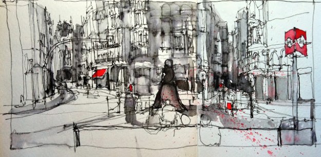
One of the artists I follow on Instagram, architect and urban sketcher Simone Ridyard, is the best contemporary example I can think of who uses this device very effectively. While the general neutrality of her drawings make her spots of color leap off the page, each element balances the other by providing the perfect foil for appreciating the black lines of her sketches.

What other artists am I forgetting who also push this idea?

Simone Ridyard

©Simone Ridyard      drawing with non waterproof ink 2, from urbansketchers.org

Color is so intoxicating that the desire to saturate and enrich a work with it can be overwhelming. (Matisse, you speak to our hearts!) But it’s also worth thinking of color along the the lines of this analogy: a full-throated chorus of many voices can make spirits soar, but the lone voice that breaks through silence has the power to lift us to equal heights.

Pyrotechnic Analogies

With all the rain we’ve had this summer, my garden is especially lush.
And while, as I’ve written before, I love the quiet and visual restraint of a winter landscape, these months of vibrant color definitely serve to recharge my batteries to carry me through the more subdued seasons ahead. In February I’ll look back at pictures taken around my yard from June through October and they’ll seem almost impossibly luxuriant.

If given a choice, I am overwhelmingly partial to purple, particularly the shade that hovers over the line between blue and violet. I have a delphinium, planted several years ago, that fully came into its own this summer. I can’t get enough of the depth and layers of color within its blooms, even as it slowly fades. It is placed so that I can see it up close just as easily from inside the house as when outside. I’ve been watching it attentively and think its dramatic change from sprigs of branched buds to full-on sprays of exuberant blossoms has been equivalent to a fireworks display in slow motion.

Embroidery part one

© 2017 Elizabeth Fram, Dye and stitching on raw silk

I suspect being steeped in this beautiful blue had a subconscious influence on choice of dye color in my current textile piece. But also, the section I’ve been working on/stitching this week certainly seems to echo this idea of slow motion reward: a measured start building into a crescendo of stitched pattern.

Embroidery part 2

©2017 Elizabeth Fram, Dye and stitching on raw silk

Hopefully I can carry the spirit of that idea forward with the next steps I have planned.

Speaking of fireworks, I’ve had them on my mind since finishing The Book of Fires by Jane Borodale. It’s a fictional tale of 18th century London that is most interesting for its view into the workshop of a fireworks maker, paired with the harsh realities of the daily workings of life in that time and place. It’s the author’s debut and a quick, entertaining read if you’re looking to add one last title to your summer reading list.

And finally, I love the wisdom of this poster by Libby VanderPloeg. It appeared this week on Sara Barnes’ illustration blog, Brown Paper Bag. It should be my daily mantra. What are you working to get good at?

VanderPloeg poster

Libby VanderPloeg

Less is More

Happily, the snow that has fallen this week has blanketed our woods again.

Respite     ©2017 Elizabeth Fram                                                      Stitched resist dyed; Hand-stitched on silk

Getting out to walk on our trails with Quinn has provided a welcome reprieve from the relative visual cacophony of pattern and color I’ve been immersed in while working on this latest cup and saucer piece. I’ve long been an avid fan of the traditionally quiet Japanese aesthetic with its subtle contrasts and expanses of open space, which probably explains why a snowy landscape represents a such a welcome counter-balance, not just to working with pattern for hours at a time, but also, theoretically, to the hectic realities of life as we all know it.

A couple of years ago I wrote a post about February’s inherently restrained character and was gratified to hear from quite a few of my Vermont friends that they too welcome this season as a time for regrouping, of calm reflection, and as a period all the richer for its subdued identity. If you live with winter for a large chunk of each year, there’s an element of self-preservation in figuring out what gifts you can glean from it.

But in thinking more about the appeal of winter’s sparseness, I did a bit of research on the idea of unadorned beauty. I came across a fascinating lecture by haiku poet Madoka Mayuzumi entitled “Japan’s Culture of Silence”. It goes a long way toward explaining, especially in relation to haiku, the significance of an “aesthetic of reduction”. Haiku invites the reader into the poet’s world, relying as much on the blank spaces incurred through its brevity, as it does on the words which comprise each poem. Mayuzumi explains: “We tend to find the greatest beauty on (sic) what is left unsaid, in the rich possibilities of blank space”.

It’s a principle that can be applied to any of the arts.

Looking out my living room window, layers of fog not only mute any sense of depth, but also lend an openness to the landscape in much the same way as snow.

I’ve always loved winter, so a snow-covered landscape is a welcome seasonal perk…just because. But from an artistic and working viewpoint, there is a lesson in the snow: the importance of finding a balance between maintaining a certain boldness (via composition, pattern, and texture) while remembering to get my point across as simply as possible.

If this subject interests you, you might enjoy this 2 minute video on the concept of “ma”, which discusses how this aesthetic of reduction is integrated within Japanese culture.

On a Different Note…                                                                                                                           

If you will be any where near Montpelier on Thursday, February 9, I would encourage you to attend mixed-media art knitter Eve Jacobs-Carnahan’s presentation Art as Action: Knitters Speaking Out. Inspired by the article What It Means To Be An Artist In The Time Of Trump, Eve will discuss and show examples of projects undertaken by art knitters to raise awareness about social and environmental issues.

Art as Action: Knitters Speaking Out
A presentation by Eve Jacobs-Carnahan
Thursday February 9, 2017 6:30 – 8 pm,
Center for Arts and Learning, 2nd floor
46 Barre St.  Montpelier, VT  05602

Colors of Sonoma

One of the many perks of travel is experiencing differences in light and color as compared with home. Being in California last week was a welcome opportunity to soak up the warm tones that predominate in that part of the world — and from what folks have said about the cold and rain we left behind in Vermont, it seems like it was a good time to be out of town.

Stone-Fruit

Stone Fruit ©2016 Elizabeth Fram                                                                                                   The richness of color in these freshly picked apricots, cherries and peach from the Sonoma farmers’ market, puts subdued grocery store varieties to shame.

I always include my small travel box of watercolors in my art supply kit, and so was able to enjoy studying and mixing the relatively unfamiliar hues of the desert hills. Vermont’s rich blues and greens during June are markedly different from the drier landscape of Sonoma County, which leans toward ochers and golds punctuated with the deep and dusty greens of trees that thrive on limited water under the hot sun.

Overlook-Trail

Overlook Trail ©2016 Elizabeth Fram

Matanzas-Creek-Winery1

Sonoma Hill ©2016 Elizabeth Fram

We were on-the-go much of the time, so I squeezed in whatever moments I could to sketch. I find it’s easier to jot down a quick drawing on site and then return to it to add color later that evening or early the next morning. The hills surrounding the County are ubiquitous, so color reference is easily accessible, even after leaving the original drawing location.

Matanzas-Creek-Lavendar

Matanzas Creek Lavender © 2016 Elizabeth Fram

Now that I’m back home with a slightly expanded palette to work from, I’ve been spending some time fine-tuning my understanding of how to achieve the colors I saw. What I’m discovering is that by paring down to fewer colors, creating mixes from just a handful of basics, greater harmony results in the overall composition. This article by Dan Schultz discusses not just that fact, but also four other reasons why limiting your palette can be beneficial.

ColorChart2

Sonoma color mixes; WN = Winsor Newton, DS = Daniel Smith

It’s surely humbling how much I have to learn. Somehow color theory seems a lot easier when working with thread, perhaps because if something isn’t quite right it can easily be undone. There’s no backing up with watercolor. But the challenge, as well as the look of layers of pigment on paper – blooms and all – is seductive and addicting, so I’ll be keeping my nose to the grindstone. I’m confident that the lessons learned will be translatable into my textile work as well.

For one who is pooch-starved, our visit to Frog’s Leap Winery held a special treat. Abbie, the resident canine, (who brings new meaning to “it’s a dog’s life” in this uplifting video … if you’re a dog lover, don’t miss it!!), came in and flopped down to cool off by my feet long enough for me to squeeze in a quick doggie sketch. Life doesn’t get much better than sitting at a table with family, drinking a great glass of wine with pen & sketchbook in hand, and having a willing dog to draw!

Abbie,-the-Wirehaired-Pointing-Griffon

Abbie, the Wirehaired Pointing Griffon ©2016 Elizabeth Fram

Artists = Gardeners = Artists

This past week my garden has burst with color. After months of living within a subdued landscape that quietly displayed spare beauty in the structure of trees, accented with the muted tones of last year’s dropped foliage, it’s pure joy to become re-immersed in full-on color!

GardenThree

Most artists I know are gardeners, and vice versa — although I wonder, do gardeners think of themselves as artists? They should; we share a love of color, form, texture and pattern, and of course a willingness to accept the challenge of arranging all those elements within a composition. This past post about Vermont artist David Stearns’ beautiful garden is a case in point.

GardenTwo

The overlap between the two disciplines is deeply ingrained for many of us. I have written in countless artist statements how formal Japanese gardens have been a huge inspiration to me, not just in their physical attributes, but in the way they direct one’s attention and how they make one feel while wandering along their paths. I continue to aspire toward that ability to say more with less in my own work.

GardenFour

But for now, I am just soaking up the pure lushness of this year’s new growth and am grateful to live where the seasons vary so strongly that as each one arrives we are ready and glad for the change.

GardenSix

Two treasured books on my shelf, each an inspiration, are ZEN|FLOWERS: contemplation through creativity by Harumi Nishi and The Flower Recipe Book: 100 Magical, Sculptural, Seasonal Arrangements by Alethea Harampolis and Jill Rizzo. They straddle the line between art and flora and offer a new way to think about both, together.

Happily, this past weekend I heard back from Arthur Schaller, the collage artist I wrote about last week, with permission to post images of his work. Here’s a quick taste that will hopefully entice you to see the work in person if you can get to the Vermont Supreme Court gallery before the end of June.

Schaller1

© Arthur Schaller

Schaller3

© Arthur Schaller

Schaller2

© Arthur Schaller

And finally, I am honored to have been asked to be in Across Roads Center for the Arts’  “Artist Spotlight” this month. The interview is available to be read here.

GardenSeven


Unexpected Gifts

The weeks between Thanksgiving and Christmas can be a bit of a scramble. However, two things brought me an extra measure of cheer this week, lifting me above my to-do lists.

Amaryllis

Amaryllis     ©2015 Elizabeth Fram

First, this interview with Joy Spontak in the December issue of the Across Roads Center for the Arts newsletter (conducted and transcribed by my multi-talented friend, Adrianna Benson). The following quote from the interview resonated with the way I like to work too, and I love the notion that Joy consciously uses this approach outside her studio as well:

“One of the things I’ve learned about my own process is that it is a conversation between you and whatever (piece) you are doing. You do something to it, it suggests something to you, and you have to think about it to move on with the piece/process. Thinking about how you’ll work this process; feeling, changing, working it past how you originally intended it, because things change. I’ve tried to apply this process to my life.”

Her point coincides nicely with one of the books I’m reading now: Breaking the Rules of Watercolor by Shirley Trevena. Trevena stresses that she prefers to leave her options open while she paints. To paraphrase, she found that “by only half-painting objects or leaving white space” she could postpone decisions, often finding that she is rewarded by holding back. What she leaves out can end up becoming as interesting as the areas she has painted, in essence making the finished work greater than the sum of its parts.

BreakingtheRules-1

The other completely unexpected treat this week is that my ‘Tres Chic’ amaryllis is blooming… again. When bringing my houseplants inside for the winter in early October, I discovered a bonus: two of my amaryllises had formed new flower buds while they were still out on the porch. They bloomed in mid-October so I figured they were finished. But now they are both going for a second showing, an unexpected and welcome gift during a dark and wet November week.

Amaryllis-3

Amaryllis 3     ©2015 Elizabeth Fram

Do any of you know how these plants managed to get in their dormant time without an extended period of darkness?  (I have 3 others that seem to be following a more normal schedule). I guess the cooler temps must have done the trick, but whatever the explanation, I’m grateful for the burst of color.


Local Color

While browsing in a Bar Harbor bookstore in August, I came across the book Local Color: Seeing Place Through Watercolor by designer Mimi Robinson.

https://www.papress.com/imageFiles/covers/480/9781616892975.jpg

The theory behind the book is that the colors of a place leave a lasting impression of that locale, especially somewhere we haven’t been before. She elaborates by demonstrating how she creates watercolor grids as a means of  journaling about the places she’s visited in order to retain a sense of that location.

That idea has stuck with me since.

VancouverComposite

Vancouver, BC  September 2015

While we wandered around Vancouver last week, I was paying attention to the colors that were representative of what we were experiencing, and making a point to think about it in my sketching as well as in what we photographed.

West Park

What most interested me here was the tangle of chair and table legs, but the room had an orange chair and table runner that created a striking contrast.

While I think it’s fair to say that most of us are attracted to and influenced by color, it’s a worthwhile exercise to be mindfully aware of it as a way of defining a location. I encourage you to give it a try.

Color1

Autumn colors beginning to pick up steam

And finally, I would be remiss if I didn’t give a nod to my adopted state of Vermont in any discussion of local color. There is such a strong sense of color identity here, especially at this time of year.

Bonus: In my research before we left for Canada, I found and planned a visit to Maiwa Supply. It is a wonderland of books and materials. Happily you can also check it out by visiting and shopping online!


Slow and Steady

This week has been full of experimentation, building on what I’ve learned so far. The process is similar to the progressive states of print-making, with each step producing unexpected discoveries that bring me a little bit closer to where I’m hoping to go.

Sketch1

Following last week’s layered drawings, I began by painting both a positive and a negative image on a piece of raw silk.


Sketch2

Using watercolor pencils and silk organza, a second layer creates the “X”. The idea to use complementary colors wasn’t so successful.


Sketch3

Staying within an analogous color zone was a smarter move.

I’ve had stitching much on my mind, trying to figure out how to integrate it so as to enhance the idea of a positive/negative dichotomy without overwhelming the under-layers and the piece as a whole.

XFinal copy

I have been envisioning a much more intensive layering of stitching rather than these simple  lines of running stitches. But for this particular rendition/sketch, the simpler lines seemed right. Although hard to see in this photo, a subtle variation of thread color leads the eye in and out of the shapes of both the plants and the “X”, beginning to touch on my goal of an uneasy sense of fluidity between fore- and backgrounds.

It’s time to sit with this for a while so I can figure out how to give stitch a more assertive voice. This example is only about 6″ square. I think working larger will help me figure it out.

Speaking of “X’s”:  before I let you go I want to share this TED Talk by Jamie ‘Mr. X Stitch’ Chalmers with you. I’m sure that those of you who also work with needle and thread will nod your head, appreciating his good humored articulation of truths we all understand so well. And for those of you who may not quite get the attraction to working in this medium, this short talk  may make a believer of you.  If you’re interested in learning more, here’s his website.

Moving Right Along

The “ice pieces” are finished and stretched; I’m still deciding about framing.

Ice1Sharp

Crystallized     12″ x 12″    ©2015 Elizabeth Fram

It somehow seems fitting to get these two sewn up for good (pun intended) in tandem with the disappearance of the last patches of snow and ice that I see on my daily walks with Lola in our woods. I’m more than ready to leave the restraint of February behind, and to dive into the color of Spring and the coming months.

Ice 2Sharp

Floe     12″ x 12″    ©2015 Elizabeth Fram

But looking out my studio window, you can see we’ve still got a way to go. In fact, it’s been very soggy & gray this week, so it seemed like the perfect time to make an exercise out of my craving for color.

Grey Day2

It can be quite a challenge (or perhaps foolhardy) to forge ahead without much forethought, and you can see that I am doing just that — with a vengeance.  I mixed a dye-bath of Goldenrod and Pumpkin, with the finished result coming pretty close to Naples Yellow, Cadmium Yellow Deep and Cadmium Orange.

Color copy

That was the easy part. So much yellow…where do I go from here?  I have to figure out a way to balance color and the various means of applying it (paint, thread, & more dye) to offset and harmonize with this rather bold beginning. Oh, and also to pull it all together within a cohesive image/composition.

Color Mixing Handbook

I have some ideas, but the first step is to consult this wonderful little book, The Colour Mixing Handbook which I have come to consider one of my most trusty guides. It suggests in its introduction that you use it “as a handy reference when you want to know how to mix a specific colour, or as a catalogue of inspiration when seeking ideas to try in your work”.

I’ll be doing just that.

PS: I’ll also be keeping two of my favorite quotes in mind:

“Don’t wait for inspiration. It comes while one is working.”    – Henri Matisse

“Inspiration is for amateurs–the rest of us just show up and get to work.”    – Chuck Close

The Essence of Spring

Color is returning to our landscape as the snow slowly melts and evaporates.  It’s a lift for my spirit to see the vibrant shades of green and red that quickly reappear after having been buried for such a long time. There is much to see and absorb as the season changes.

Red barked dogwood, moss & Lichen

Red-barked dogwood, moss and lichen

Contrasted with the earthy shades of stones that have just emerged from under the snow, the vivid moss that survived through months of subzero temps is a wonder in both its color and its resilient softness.

Stones and Moss

Stones and moss

With the remaining snow as a backdrop, textures become more noticeable and appreciated.

Pine

White Pine

The shadows plants cast against the smooth surface of rocks create interesting abstract patterns. I can’t help but think of arashi shibori (wrapped resist).

Shadows

Shadows on Stone

Arashi

Arashi Shibori

Wide swaths of white still cover large portions of the garden, offering a counterpoint and an opportunity to look at individual features differently than during the rest of the year. It’s easier to frame interesting compositions because everything is still pared down to essentials. Variations of tone carry new weight in their subtlety.

The areas of “empty” space created by the remaining snow, offer a compelling contrast to these characteristics, simultaneously creating both weight and breathing room. And because color is just reemerging, there is a sense of promise that is missing during late fall and winter.

Courtyard Garden

Courtyard Garden

Seeing my yard and garden in this way reminds me of the visual elements of Japanese gardens that I find so irresistible. Spring calls attention to the essence of the garden. It provides a chance to appreciate the intrinsic nature of plants through their inherent structure and their understated textural variations that aren’t as easy to see once their leaves and the grass have filled in. Irregularities that will become hidden once the beds are back in full bloom, are now their pride.

All of these elements carry strong suggestions for new work. I don’t think of myself as a landscape artist, but there’s no denying that my surroundings have a strong effect and influence on my thought process. The ice pieces I began in February are mostly finished and it’s high time to leave the winter months behind and to begin to concentrate on what’s to come.

PS:  The photos above were taken yesterday, the post written right afterward. This is what we awoke to this morning.

StoneSnow

It looks like I will have more chances to enjoy the essence of spring…proving once again the Power of Persistence.