Author Archives: ehwfram

About ehwfram

I am an artist living in Vermont, inspired by the day-to-day details of life.

When 1 + 1 = More

Having decided to include both drawings and stitched work in Drawing Threads, I have been thinking quite a bit about multi-disciplinary artists lately. I’m sure their motivations are as varied as the artists themselves, but I do wonder about the thought process of those who choose to divide their energy between mediums.

Divide and Conquer

Divide and Conquer      ©2017 Elizabeth Fram, Stitched-resist Dye and Embroidery on Silk, 14 x 11 inches    Photo: paulrogersphotography.com

The main reason that drawing has become such a mainstay in my own practice boils down to time. Being able to complete a thought and have a sense of accomplishment in one sitting, rather than the days into weeks that large textile pieces require, has propelled my ideas forward much more quickly in both disciplines.

Key Lime Pie

Key Lime Pie     ©2017 Elizabeth Fram,  Ink on Paper, 11 x 8.5 inches

The following is an excerpt on the subject of multi-disciplinary work from an interview with Lisa Ferber on the Huffington Post Blog, 3.21.12

Explore. Don’t feel a need to stick to just one method of self-expression. “You are not just a writer or an artist — you are a creative person, so don’t limit yourself to a particular medium, such as painting, writing, or performing,” says Ferber. “I love being multidisciplinary. I see myself and all people as unlimited creative forces. I always create out of joy, whether it’s with a pen or a brush or in front of a video camera.

With that thought in mind, I’d like to share several of my favorite artists from Instagram who spread their work between more than one discipline.

  • Australian artist Veronica Cay, pairs drawings/paintings with ceramic sculptures. She often incorporates snippets of fabric into both, adding an interesting dimension that — no big surprise — is particularly appealing to me.
Veronica Cay Transgress, Whatever Happened

© Veronica Cay    “Transgress”, 2014 (left)      “Whatever Happened”, 2017 (right)

  • Nigel Cheney is an extraordinary draughtsman from the UK whose eye for detail also translates into a passion for stitch.
Nigel Cheney Hare and Cinquecento

©Nigel Cheney      “Hare”, 2009 (left)      “Cinquecento”, detail 2010 (right)

  • Geninne Zlatkis’ work depicts animals, birds, and plants. She paints their images on paper, tools them into leather, and etches them into the pottery she creates.  She also makes masterful hand-carved stamps. Her stunningly colorful photography captures the New Mexico landscape where she lives and the natural objects she collects from it.
Zlatkis Blue Bird and Leather Cuff

©Geninne Zlatkis     “Blue Bird”, (left)      Leather Cuff, 2015 (right)

  • Zachari Logan, whom I’ve written about before here and here, combines a spectacular drawing practice with equally intriguing ceramic sculptures.
Logan Fountain and Metamorphosis 2

©Zachari Logan       “Fountain I”, hand-built clay body, 4x4x4.5 feet, 2013 (left)       “Metamorphosis 2”, blue pencil on mylar, 10 x 17 inches, 2013 (right)

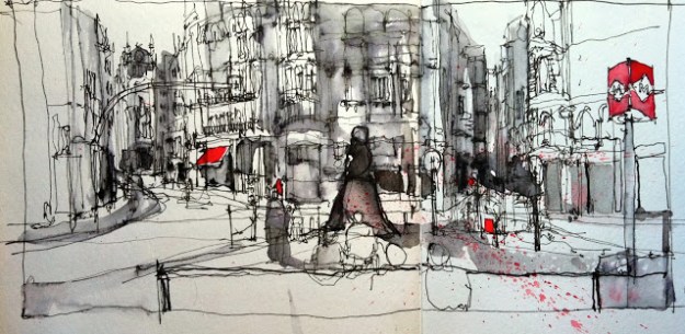
  • Lynn Chapman is a self-described plein air painter, textile artist, and illustrator from the UK. She is very active with Urban Sketchers. The lines of her drawings are fluid, economical, and very expressive, while her textile pieces celebrate color and marks with an equally flowing feel.
Chapman Ceres Cafe and Landscape

© Lynn Chapman     “Cafe Ceres 11” (left)     “landscape detail” (right)

I’d be remiss if I didn’t also mention friends who balance more than one discipline…

  • Dianne Shullenberger’s textile collages, colored pencil drawings, and sculptural objects are an ongoing expression of her love for nature.
  • Almuth Palinkas is a tapestry artist and painter. Her devotion to beauty is evident in all her work.
  • And Roz Daniels makes striking art quilts that, as with her stunning photographs, depict her strong inclination toward simple geometry.

And of course many, many masters delved into multiple mediums.
One final thought: when you have time, read this article about Ellsworth Kelly’s Temple for Light, which is an inspiring culmination of multidisciplinary achievement and, in many ways, a place to worship the deep waters of creativity.

10 Days of Stitches

It’s been nice to get back to stitching again after being out of the studio for 10 days and then becoming immersed in computer work in preparation for Drawing Threads at the Gruppe Gallery.

I find that taking pictures mid-process, often at the end of each day, gives me just enough distance to plan out what I’m going to tackle next, while marking the evolution of a piece for later reference.

Silk and water-soluble pen

Water-soluble pen marks on raw silk give me the guidelines I need for adding the stitches which will create the Shibori pattern once the fabric is dyed.


Dye surprises

Surprises always occur during the dye process


Back-side to

It’s worth checking out the “wrong” side to see if that might be a better option. I opted for the deeper colors of the “front” in this piece, but it’s still fun to see the strength of the blue on the back-side.


Outline stitching

Outlining with stitches of a middle value give me a basic structure to work from. Often, as the piece progresses I’ll stitch over those lines with a color/value that is better for bringing out the form. If you look closely you can see the white lines that are my guide. After reading Michelle Kingdom’s interview on textileartist.org, I learned about graphite paper as a means of getting your initial drawing on cloth. It gives a much cleaner line than the water-soluble pen I had been using.


Transfer paper

This is the product that I’ve been using to create my initial outline. I chose white so it would show up on a dark background, but it is available in other colors. While Michelle Kingdom mentioned that the graphite paper she uses is permanent, the lines created by this paper are not. I have to think ahead and be careful not to touch the lined area because it will rub off so easily…both good and bad.


Negative image

With the deeply dyed background, my images are often a mix of positive and negative. Here, white stands in for what would be a black line if I were drawing on white paper.


Textural stitches

I’m fond of the textural effect of the stitches that curl along Quinn’s back, making for a suggestion of fur without being literal.


Stitching on the bed

Stitching her bed opens up an opportunity to play with shapes and textural effects, adding an abstracted element while working in tandem with the pattern of the shibori and the more realistic depiction of Quinn.


Detail stitches

Finishing stitches at the end can be tiny additions that subtly affect the whole. These details are time-consuming but one of my favorite parts of the process.


4 stitches

Speaking of details: There was something about her back that was bothering me. It can be a huge breakthrough once you figure out what needs to change, and often it’s just a minor tweak. I removed the 4 stitches that I’ve circled in red – as you will see in the next picture – and it made all the difference.


Snug

Snug     ©2018 Elizabeth Fram,  Stitched-resist Dye and Embroidery on Silk. It will be framed to 8 x 8 inches

All this time spent stitching provides a great opportunity for listening. Not too long ago, my friend and mixed-media/knitting sculptor Eve Jacobs-Carnahan recommended listening to an episode about El Anatsui’s 2009 piece “Black River” on The Lonely Palette podcast. If you are interested in Anatsui’s work, I’m sure you will also find the 23 minutes well spent. Since then, I’ve been catching up on all the Lonely Palette episodes — each discusses one piece from the Boston MFA collection in detail. Host Tamar Avishai dusts off art history, giving listeners context and anecdotes that make you hungry to learn more. See if you don’t agree.

Sweet Dreams, Squirrel TV, & a Sneak Peak

The only souvenir I brought back from our recent trip was a small book purchased in the SF Moma bookstore. Angus Hyland and Kendra Wilson’s The Book of the Dog – Dogs in Art is a charming little collection of dog paintings that span from the 18th century to the present. As the authors note in their introduction, “the undying love of a dog is of course requited on these pages”, which is surely what snagged my attention in the first place. It’s not an exhaustive survey, but rather an eclectic collection of engaging pieces that celebrate the dog/human relationship and the ways that bond irrefutably changes us both. The artwork within is relatable without being sentimental.

Book of the Dog

When I think of my own trusty models, it is certainly true that the amount I have learned from our 3 beloved pooches, as they’ve patiently let me draw them over and over, is immeasurable.

Rather than writing at length this week, I spent most of my blogging time drawing.

Quinn

©2018 Elizabeth Fram

Quinn1

©2018 Elizabeth Fram

Quinn2

©2018 Elizabeth Fram      Our windows are Quinn’s TV. The squirrel channel is on at all hours. Many times I have but a fleeting moment to try to capture a quick outline before she dashes off to another window. You can see the ghost beginning of an abandoned sketch in the upper left corner of this one..

Quinn3

©2018 Elizabeth Fram

Quinn4

©2018 Elizabeth Fram

Quinn 5

©2018 Elizabeth Fram       It wouldn’t tell the full story if I only showed finished images. I have plenty  of interrupted sketches that record my stops and starts as Quinn moves. For instance, she wasn’t holding her paw at this unnatural angle, I just had to abandon her head when she readjusted, opting to capture her foot instead.

©2018 Elizabeth Fram

Quinn7

Slumber     ©2018 Elizabeth Fram, 8.5 x 11, Ink on Paper

Drawing Threads… Sneak Peak  _______________________________________________________________________

I’ve reached the stage of pulling together all the various loose ends in anticipation of my upcoming show Drawing Threads: Conversations Between Line & Stitch. As I approach the finish line, one of my “icing on the cake” projects is figuring out how best to group the textile pieces with the drawings so that the conversation between them is apparent. This photo shows just a fraction of the work; our long hallway is great for this job.

Layout

Amuse-bouche…

The show will be on view at the Emile A. Gruppe Gallery from March 22 – May 6, 2018, with an opening reception on Sunday, March 25 from 2-4pm. Please join us!
Regular gallery hours are Thursday – Sunday, 10am – 3pm, or by appointment: 802.899.3211

Drawing Threads


Polishing Memories

After a welcome vacation, I am back to my routine. When I sat down to write and consider images for this post, it suddenly occurred to me that I took very few photos and spent even less time drawing while away.

We were visiting two favorite places, San Francisco and Kailua, Oahu, easily the cream-of-the-crop of the numerous locales my husband and I have called home during our life together. For once, I didn’t feel any particular need to record what I was seeing, and for the most part I just let the sights and experiences be enough. It was surprisingly liberating.

Teotihuacan Bowl

An intricately decorated bowl from the De Young Museum’s exhibit “Teotihuacan”

On my way to the De Young Museum to see the exhibit “Teotihuacan”, cherry trees, fuchsia, and vinca bloomed in the bright and warm sunshine of Golden Gate Park — a welcome change after leaving Vermont in the midst of a chilly snowstorm the day before. And as the day came to an end, a ribbon of hot pink progressing to fiery orange hovered over the thinnest strip of deep blue horizon, lightly resting on the Pacific Ocean like a technicolor meringue. No photo or drawing can compare to being fully in those moments.

Ko'olaus

Perhaps counterintuitively, I had my back turned to Mokoli’i, a popular scenic spot on the windward side of Oahu, choosing to  take this shot of the Ko’olaus instead. The deep furrows in this mountain range  remind me of the pleats created in the process of Arashi Shibori.

A couple of days later, we sped along the H3 Highway from the Honolulu airport to Kailua. The lush green of the Ko’olau Mountains, deeply engraved by threads of waterfalls that have trickled down their sides for centuries, paired with the scent of humidity and tropical flora, brought in a sweep of memories formed at a time before iPhones and when I was way too busy with little ones to spend more than a few cursory moments here and there drawing.

Byodo-In Temple

The Byodo-In Temple on Oahu is one of the loveliest places I can think of. We visited frequently when we lived on the island, and make a point of going back each time we return. The following photos are all from the temple.

There’s nothing like a full sensory experience for facilitating re-entry into a bubble of remembrance. For whatever reason, the image of a snow globe popped into my head, and it occurred to me that what I was experiencing could be equated to looking into one of those little enclosed worlds while reawakening it with a good shake. Although, like memory, there’s no way to physically (re)enter the environment it confines, an emotional magic resurfaces from somewhere deep within to be felt and enjoyed once again.

Amida Buddha

Which brings me to this: five years ago author Jonathan Safran Foer gave the commencement address at my son’s college graduation. Unlike the speaker at my own commencement — of whose talk I remember exactly zero — Foer’s message has stayed with me. In a nutshell, he was observing that the world can be divided into two camps: archivists, who take full advantage of technology to document life’s both great and small events, and eye-witnesses, who record nothing physically but rather rely on memory alone.

Raked Gravel

Short-lived moments are precious, which dictates the desire to capture them in photos or on video. Yet human memory involves emotion in a more direct way than technology. The point of Foer’s speech was that being more fully present allows us to hold onto our experiences more closely. He wasn’t saying one approach was better than the other, only that striking a balance between the two is perhaps the wisest course.

Koi

I don’t think I could ever give up my camera. And as I have often expressed, the act of drawing allows me to more fully notice and record details that I might otherwise miss, in some ways strengthening a memory of time and place. But it isn’t the same as basking in a fleeting experience without any buffers or intervening devices. This time around I was happy to let go of the tools and to enjoy both the restfulness and the exhilaration of immersing myself in a change of environment without them.

On a Different Note_________________________________________________________________________________________

My mother-in-law has a great eye and a wonderful collection of art books that are always a treat to peruse whenever we visit her. She is often ahead of the curve in ferreting out interesting artists and reading material about them. She requested a subscription to Juxtapoz magazine a while ago, so this trip I had an opportunity to sift through several she has saved. I was very impressed — feeling it has a fresher and less “establishment” approach than ARTnews or other like publications. The interviews of highlighted artists are smart and well-written, going into the depths of practice without being oppressively long. I think you might find it worth checking out.


Family Affair

My hat is off to Able Baker Contemporary* of Portland, Maine. Their new exhibition Circle Time – Children and their Artists, (running 1/26 – 3/3/18) cleverly pairs the work of “local luminaries” (as one notice termed them) with the art of the young people in their families.

Cardinal

With such a great subject to write about, how could I resist sifting through the pages of saved artwork from my own two kids, looking for pieces that speak to me with the same sense of “transcendent visual art” referenced by the Able Baker Contemporary essayist? With my kids’ permission, I’m sharing a couple of my absolute favorites from each of them.

The curator’s accompanying essay frames this exhibition as something of an homage to the freedom and integrity of “childlike” creativity, touting its fearlessness as both an example and an influence for the mature artist, and for all who think visually.

Yet I see this show as so much more.  My process and resulting work was for many years largely informed through the necessities and demands of raising a family. The main reason I began to explore textiles as an art form in the first place was due to their non-toxic nature, making them safe to use in the presence of children, and the fact that I could pick up and put down work in a heartbeat, squeezing time for art in around the corners of all the other demands on a young mom’s attention. That’s undoubtedly why I find this exhibit a refreshing acknowledgement of the fuller picture behind the practices of the parent artists.

Lauren's Giant

Design-wise, I am captivated by the balance of elements in this piece that is the back cover of a book made by my daughter.

So often the backstage lives of emerging and young career artists are largely ignored unless there is something “noteworthy” to grab our attention, i.e. an illness overcome or exotic place lived that has influenced the work. There is little attention paid to the nuts and bolts backstory of the many who are diligently making art while simultaneously juggling the the day-in / day-out routines and challenges of being a parent.

Stu's Sunset

I see from the date that my son was two when he painted this sunset. We were living in Hawaii at the time. The colors say it all.

The genius of Circle Time, beyond acknowledging the enviable freedom and beauty to be found in a child’s art, is the celebration of the layers of life that contribute to and have sway upon the resulting work of the mature artists exhibiting alongside their children. Recognizing this bigger story as a necessary component in the evolution of the work and careers of these artists makes for a much deeper and more accessible experience for the viewer.

Stu's Lobster

As a native Mainer, I never met a lobster I didn’t love. This one takes the cake. There is something about the blue water that makes this piece sing for me.

I regret I probably won’t be able to swing a trip to Portland before the show closes on March 3rd, but I will be watching, and encourage you to follow, as the gallery continues to share images through Instagram.

*Able Baker Contemporary presented Selvedge last summer, an exhibition I was so glad to be part of, exploring the work of artists who embrace the history of painting via textile techniques.

A New View of the Olympics

As the Olympics get underway there is good news for the arts. The New York Times reported this week that four athletes will be participating in the Olympics in Pyeongchang, not as competitors, but as artists in residence.

Snoozer 1

Gold     ©2018 Elizabeth Fram, 8.5 x 11 inches, Ink on paper                                                              No question, we have an Olympic caliber snoozer in the family.

Did you have any idea (I didn’t) that for almost 40 years (1912-1948) Olympic medals were awarded for artistic excellence in painting, sculpture, architecture, literature, and music in addition to athletics? The practice was instituted by Baron Pierre de Coubertin, founder of the modern games and the IOC. Classically educated, de Coubertin held the belief that to be a true Olympian one must exhibit skills in music and literature to round out athletic prowess. He couldn’t conceive of a re-creation of the original games without the inclusion of the arts. To read more about this forgotten piece of history, check out Joseph Stromberg’s article for Smithsonian.com which outlines the rise and fall of the arts segment of Olympic competition.

Snoozer 2

Silver    ©2018 Elizabeth Fram, 8.5 x 11 inches, Ink on paper

Fast-forward to contemporary times…in strategizing a roadmap for the future of the Olympics, the IOC has instituted Agenda 2020 which, among other initiatives, recognizes that the arts should be restored to their rightful place at the Games. An artist in residence program was established in 2014, kicked off with French street artist JR, American Vine star Gerald Andal and German writer Tilman Spengler.

Bronze

Bronze      ©2018 Elizabeth Fram, 8 x 7 inches, Ink on paper

This year’s artists will be bringing a more direct return to de Coubertin’s original vision as, in addition to being artists, they are all former Olympic athletes. There will be no medals involved, but in keeping with the Olympic values of friendship, respect, and excellence, these artists will be making work alongside and, in some cases, with this year’s athletes.
I can’t think of a better way to elevate and promote the spirit of the Olympics.

For more information on the partnership between artists and the Olympics, read about the AOTO (Art of the Olympians). A foundation created by the late Olympian and artist Al Oerter, AOTO is a “unique platform (that) shows the connection between sport, art and the Olympics and celebrates the Olympic and Paralympic athlete, while promoting Olympic ideals and values”.

And speaking of artist residencies, I just learned I will be heading to the Vermont Studio Center for Vermont Artists’ Week this spring!

Partners

The series of shibori-dyed and embroidered pieces I’ve been making for the past year are all tightly connected. Ideas that crop up in the midst of working on one usually find their way to actualization in the next. As such, all the works are related and in many ways companions. Yet these two peonies, the first pieces I’ve completed in 2018, are more tightly paired than all the rest.

Crescendo

Crescendo      ©2018 Elizabeth Fram, 14 x 11 in., Stitched-resist dye and embroidery on silk.                                                                                                   This piece is now framed and has been sold to a  collector who has very generously agreed to delay shipment until after my upcoming show is finished. Follow the progression of its creation

As interpretations of a couple of sketches made two days apart last July, (note the progression of the blossom opening), they will be viewed side-by-side in my upcoming exhibit Drawing Threads: Conversations Between Line & StitchVariations in tone and scale are slight enough to leave no question that they were conceived together, yet subtle differences allow each to carry its own voice.

Pesante

Pesante      ©2018 Elizabeth Fram, 14 x 11 in., Stitched-resist dye and embroidery on silk.                                                                                                         Finding the right title is often challenging. I wanted to find names that would match the feeling of these pieces. The full opening of a peony is glorious, and the word Crescendo perfectly matched the anticipation and build-up to a peony at its peak. Pesante, also a musical term, means “in a heavy manner”. It seems to fit the nature of the flowerhead in this image perfectly.

I dyed the silk for both of them at the same time, but with attention to maintaining some differentiation. Crescendo’s background is deeper and more saturated, begging for the strength and pop of the bold magenta threads. Powerful color allows the stitching to maintain authority amid the surrounding intensity of dye, while also providing a means of grounding the more open and fluttery petals.

Crescendo, detail

Crescendo, detail     ©2018 Elizabeth Fram

The flowerhead of Pesante, heavier and more compact than that of Crescendo, works in tandem with its more muted background dye tones and the dustier colors of thread used to describe it. Its visual weight allows Pesante to hold its own against its showier sister.

Pesante, Detail

Pesante, detail     ©2018 Elizabeth Fram

Both images explore the same vase and table surface, yet it became apparent that each had to be approached differently…another fruitful learning experience.

These pieces are not a diptych, although they will be displayed together for the duration of the exhibit. They are independent of each other but they are still partners, which reminds me of a line from Kahlil Gibran’s poem On Marriage

“Sing and dance together and be joyous, but let each one of you be alone,
Even as the strings of a lute are alone though they quiver with the same music.”

On a different note:_________________________________________________________________________________________

It will come as no surprise to anyone who knows me that this book by David Remfry looks absolutely charming.  Parka Blogs has more info.

The Strength in a Single Voice

Vibrant color is hibernating at this time of year.
As I’ve discussed before, there is much to see and appreciate in the subtle tones that surround us during the winter months, but stick with me for a slightly different story.

Frostbitten

Andrew Wyeth, Frostbitten, 1962, Watercolor on paper

While driving south on Route 89 the other day, I was casually appreciating the muted beauty of the roadside fields and hills when a tiny rectangle of brilliant fluorescent orange caught my eye.  It was nothing but a small and temporary construction sign on Rte. 2 that runs alongside the highway, not exactly an item of any particular interest or visual appeal. But the strength of that spot of color in the midst of a world of neutrals was startling.

Andrew Wyeth, Flood Plain, 1986, Tempera on panel, 24.5 x 48 in.

I have been trying to think of works of art that push the concept of presenting judicious limitation of color while containing such a spark, and it has been something of a challenge to find many examples.

The German

Andrew Wyeth, The German, 1975, Watercolor, 21 x 29 in.

Andrew Wyeth is the one artist who kept coming to mind. He was a master of the concept, as the paintings above illustrate.

One of the artists I follow on Instagram, architect and urban sketcher Simone Ridyard, is the best contemporary example I can think of who uses this device very effectively. While the general neutrality of her drawings make her spots of color leap off the page, each element balances the other by providing the perfect foil for appreciating the black lines of her sketches.

What other artists am I forgetting who also push this idea?

Simone Ridyard

©Simone Ridyard      drawing with non waterproof ink 2, from urbansketchers.org

Color is so intoxicating that the desire to saturate and enrich a work with it can be overwhelming. (Matisse, you speak to our hearts!) But it’s also worth thinking of color along the the lines of this analogy: a full-throated chorus of many voices can make spirits soar, but the lone voice that breaks through silence has the power to lift us to equal heights.

Searching Through Line

There is a light covering of snow on everything today, making the fields look like fresh sheets of paper.

Scott

Scott, detail     ©2018 Elizabeth Fram, 24 x 18 inches, Graphite on paper

One of the many gifts our dog Quinn has bestowed upon me is being an insistent impetus for stopping whatever else is in the works at 2:30pm to make sure I get outside to enjoy the day. As she runs and sniffs on the new snow, her tracks break through the smooth surface leaving a chaotic trail telling of her excitement as she follows – here, there, and everywhere – the scattered scents of the various critters that share our hill. It reminds me of Bill Keane’s comic strip Family Circus that occasionally displayed a wandering dotted line showing the vast amount of ground covered by 7-year old Billy as he distractedly went from point A to point B.

When I look at my life drawings I see a comparable trail of graphite. The lines are searching and sometimes scattered, marking my numerous attempts to grasp just the right angle or shape while leaving behind a recording of the full experience.

Lost in Thought

Lost in Thought   ©2018 Elizabeth Fram, 24 x 18 inches, Graphite on paper

I don’t begrudge myself these explorations because without them I’ll never improve. In fact, it is a similar probing quality that attracts me to master drawings. Unlike a polished rendering, an amended line speaks to the presence of the artist and his journey through his drawing, leaving tracks for the rest of us to follow and to learn from. Needless to say, it’s also reassuring to see that even the best don’t always get it right on the first stab.

Take a look at Charley Parker’s blog Lines and Colors. Not only does it promise a wealth of interesting and far-reaching information, but this post about Whistler’s drypoint etching of Joanna Hiffernan is particularly pertinent to this discussion about a searching line. Even better, the ghost face of a previously begun etching, that Whistler didn’t bother to conceal before starting over with this particular drawing, is a wonderful example of a “map” left behind for the rest of us to discover and to enjoy.

Pulling it all Together

The countdown is on.
This is the first I’ve mentioned it here, but I am in the midst of preparing for a solo show that will run for 6 weeks at the Emile A. Gruppe Gallery starting in late March. It’s exciting to be in the organizational phase of pulling together everything that I have been working on for the past year. Every opportunity I have to show my work reflects the privilege I feel at being able to share my interpretations and insights, and with that comes responsibility.

Cozy

Cozy      ©2017 Elizabeth Fram, 11 x 8.5 inches, Ink on Paper

As you well know, it’s not at all unusual for tendencies toward creativity to be squelched at an early age by rewarding only those who are able to render a realistic likeness or by shaming those who color outside the lines, both literally and figuratively. It’s so important to encourage all young people, as I was fortunate to have been, rather than deterring them in their creative explorations.

Years ago, when volunteering for an art project in my daughter’s second grade class (they were making cornucopia placemats in anticipation of Thanksgiving) I was surprised when her teacher insisted that they paste the cut-out fruits and vegetables in a specific way, and then appalled at witnessing her anger upon discovering some were ad-libbing the prescribed process. This was an art project, for heaven’s sake, to make placemats for their upcoming classroom Thanksgiving party!  It was even more upsetting to me when she proceeded to single out one child as “the artist” in the classroom, announcing that that person was completing the project correctly and her example should be followed. How demoralizing! This must surely have sent the message that creativity wasn’t valued and that the artist “slot” had already been filled.

The next month all parents were invited to sign up to come into the same classroom to share a family holiday tradition. Our family used to make gift wrap by stamping craft paper with sponges lightly dipped into acrylic paint, covering the paper with colorful images. I brought in supplies for everyone and we rolled up our sleeves to get to work. It distressed me how many children in that classroom were concerned that they were “doing it right”. In fact, they almost seemed fearful they might make a misstep. Remembering the Thanksgiving placemats, I felt it was my duty to assure them that there was no right or wrong way to make art…that was the beauty of it. I wanted them to hear from another adult that they were fully in charge of their own work; it was meant to be fun. Period.

Stack

Stack      ©2018 Elizabeth Fram, 8.5 x 11 inches, Ink on Paper

Which brings me back to responsibility. For those of us who have found our way to spending our time making things and expressing our ideas creatively, I truly feel it is our job to pay close attention to the world around us and then to share what we’ve learned with others via that work. This opens a door not only to connection, but also to varying perspectives. What we make may or may not resonate with anyone else, but it’s important to bring it out into the open. It is powerfully rewarding when someone approaches me to say they have found a personal connection between their own life experience and what they see in my work. As Degas said, “Art is not what you see, but what you make others see”.

My upcoming exhibit will include both Shibori stitched pieces and drawings from my daily sketch practice. The basis is to show how each discipline has influenced the other and to honor the “every day”. These works are not political per se, yet my goal is to highlight that the quiet moments of our lives are just as important as the outwardly momentous ones, and perhaps more so in times of uncertainty and upheaval.

Having decided on a title, I feel I have checked off one of the more challenging preparatory elements of any show (aside from making the work itself). Also, I want to share the many resources that have made this organizational phase much easier to navigate. Alyson Stanfield has a terrific customizable exhibition checklist that is well-worth bookmarking. For more helpful resources, check my posts Behind the Scenes and It’s Not Just About the Art.

In the weeks ahead, as I continue to pull everything together, I expect to return from time to time with other behind-the-scenes aspects of preparation. But in the meantime, I hope you will put Drawing Threads: Conversations Between Line & Stitch on your calendar. It will open March 22, 2018, with an artist reception on Sunday, March 25th.