One of the most encouraging essays I’ve read in a while, “My Best Teacher Lives in a Cardboard Box”, was written by Danny Gregory. In it, he reminds us that all is never lost and we can actually learn a lot from ourselves if we put a little time and space between the actual making of our work and our assessment of it.
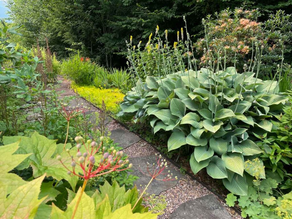
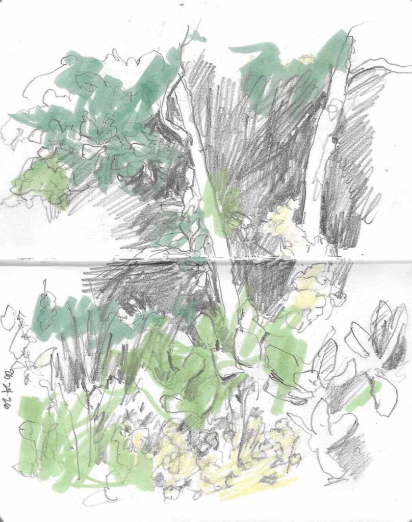
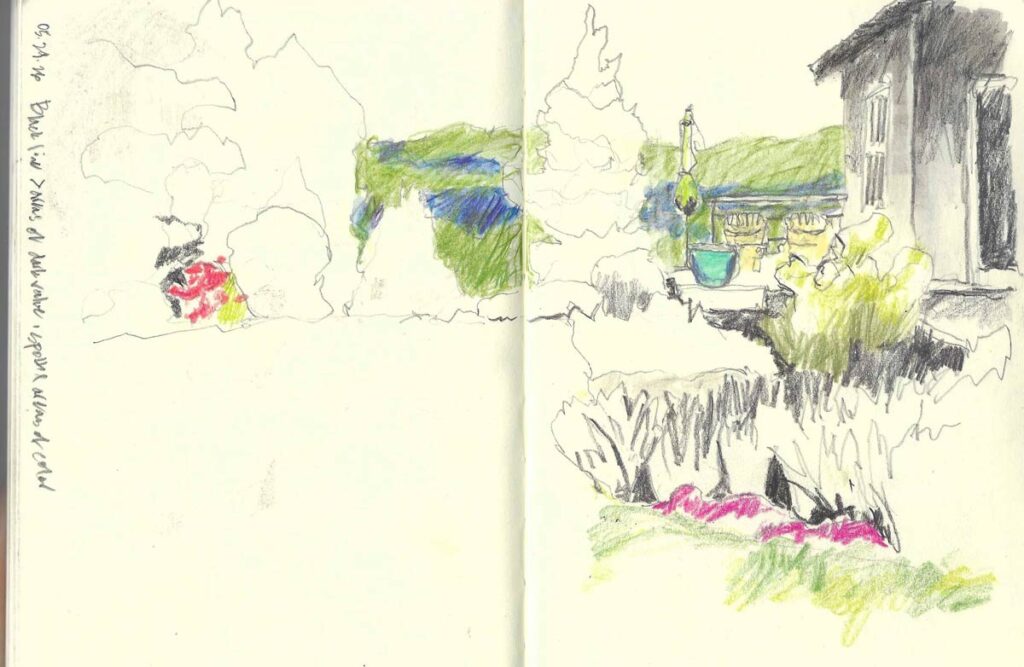
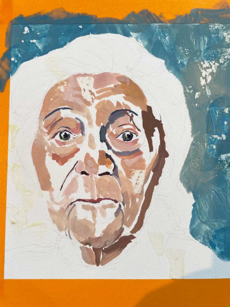
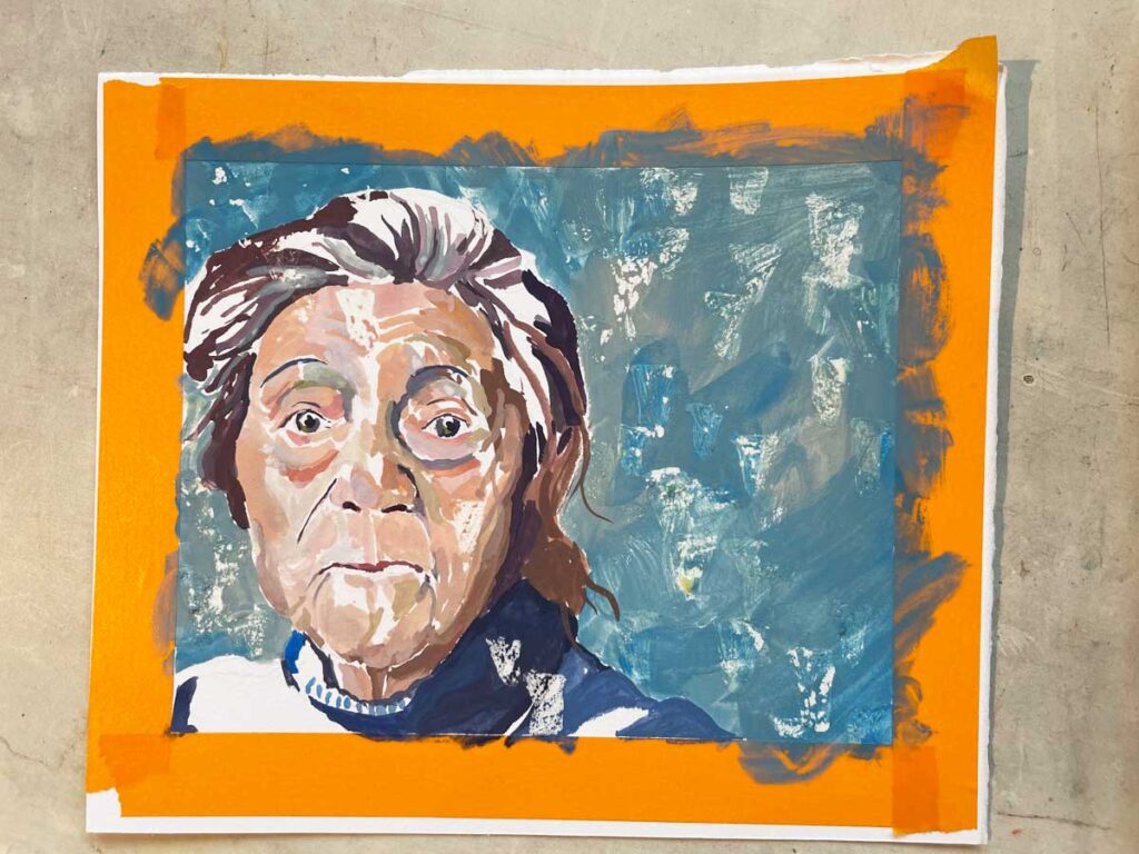
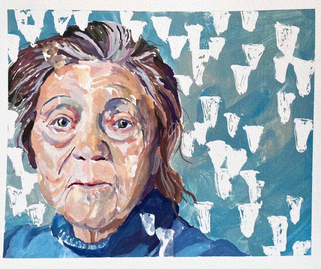
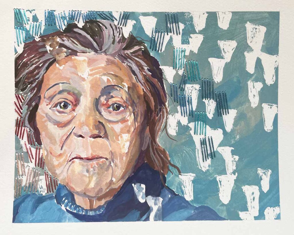
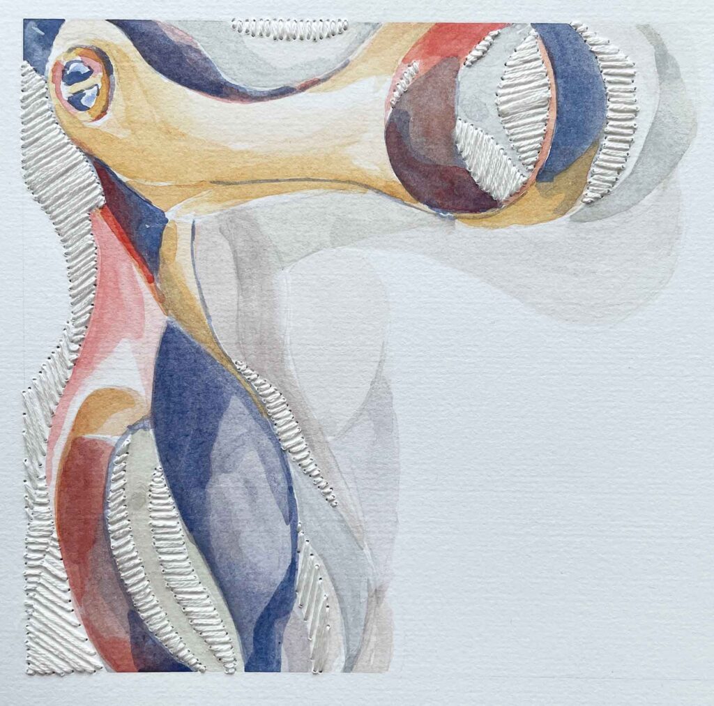
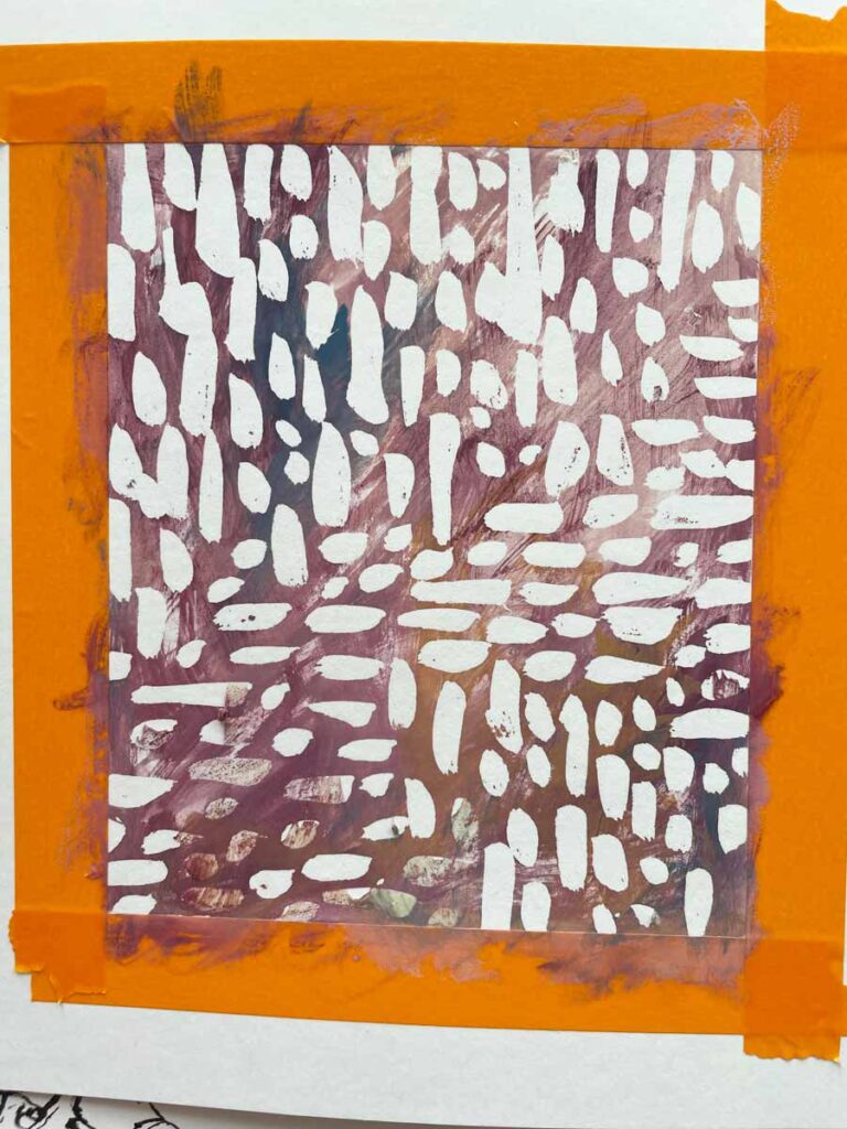
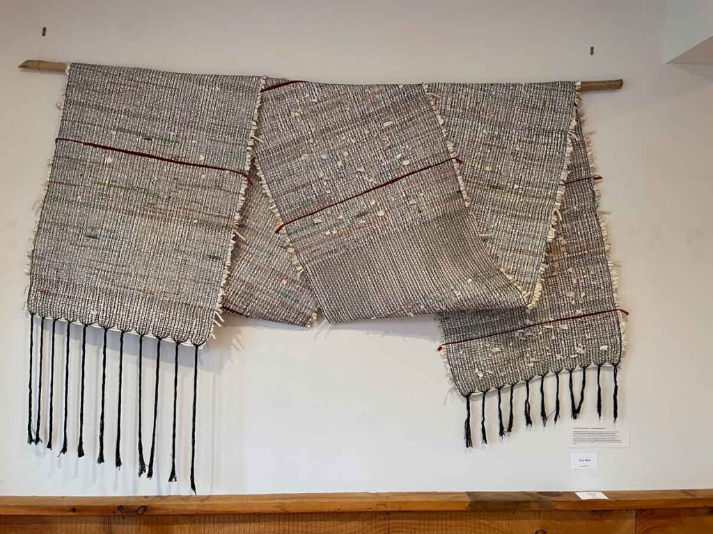
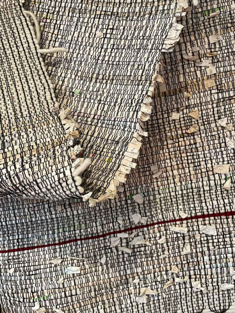
A slice of our quintessentially ephemeral art project that my husband and I work on together each summer.
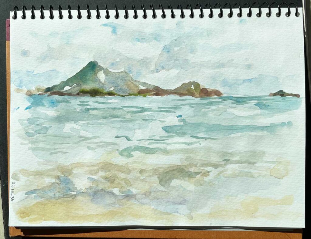
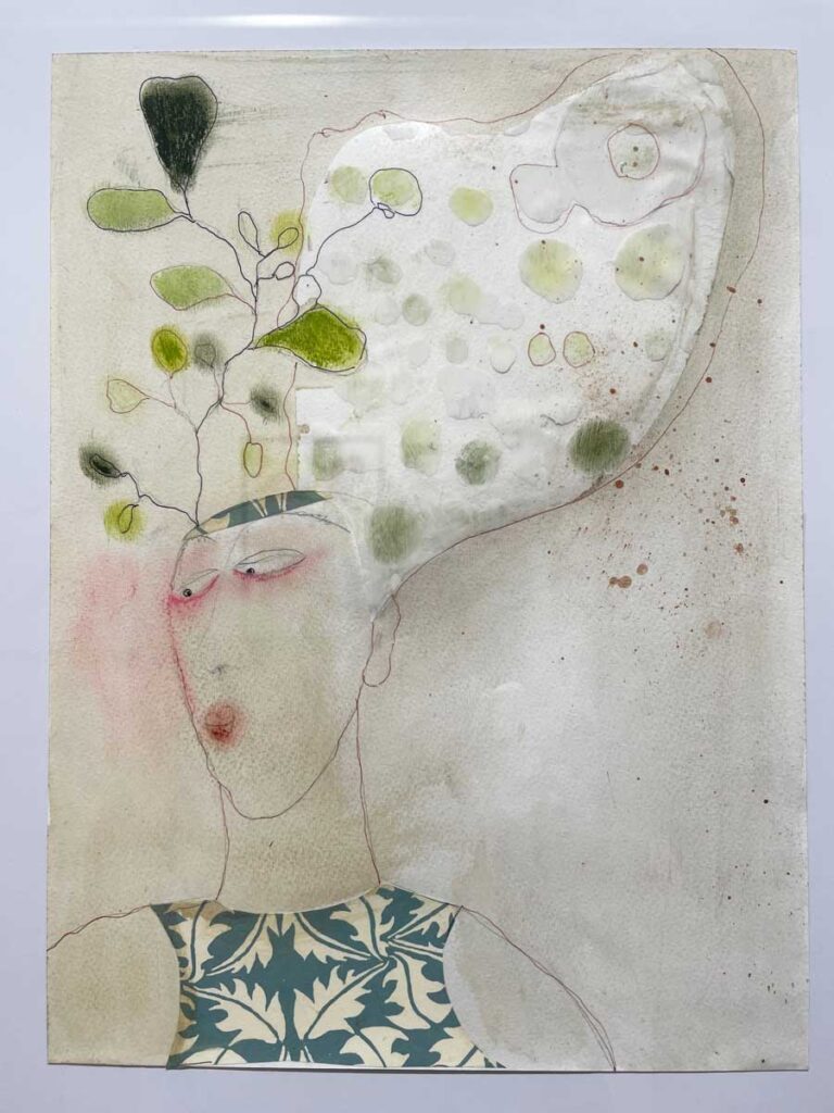
I don’t have a regular review process like his, but I’ve been getting a taste of what he’s talking about about as I’ve combed through old artwork and my past Eye of the Needle posts in an effort to organize what I’ll carry over to my new website. I can’t help but wonder what doors a seasonal – or at least an annual – review of what I’ve been making might open for me. It’s remarkable what we forget we’ve done in our drive to continually push forward.
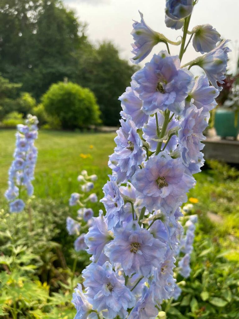
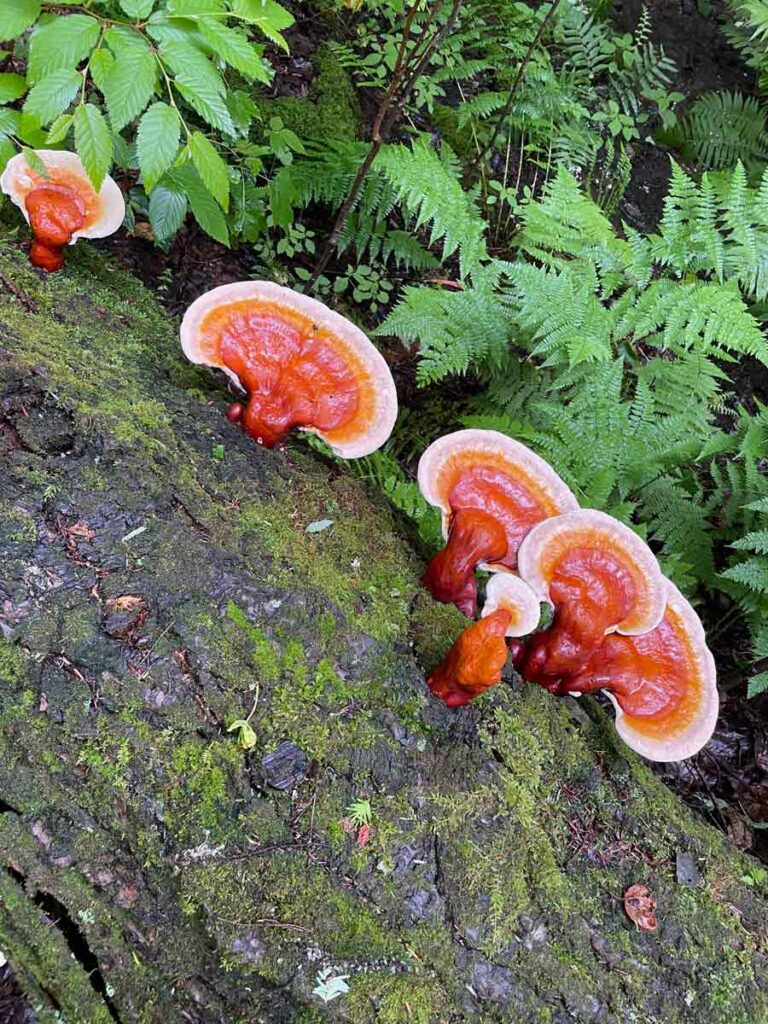
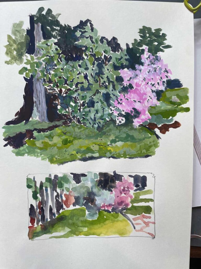
These are the beauties I most look forward to each year.
As outlined in the quote below, Danny’s idea of a collaboration between your old and current selves is brilliant:
I dig up an idea I once abandoned and see whether there’s any juice left to squeeze out of it. Usually there is. I’ve picked up so many new skills since I quit on it that Earlier Me and Current Me can finally collaborate: He had the idea, I’ve finally got the chops, and between us we get the thing done.
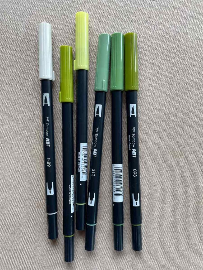
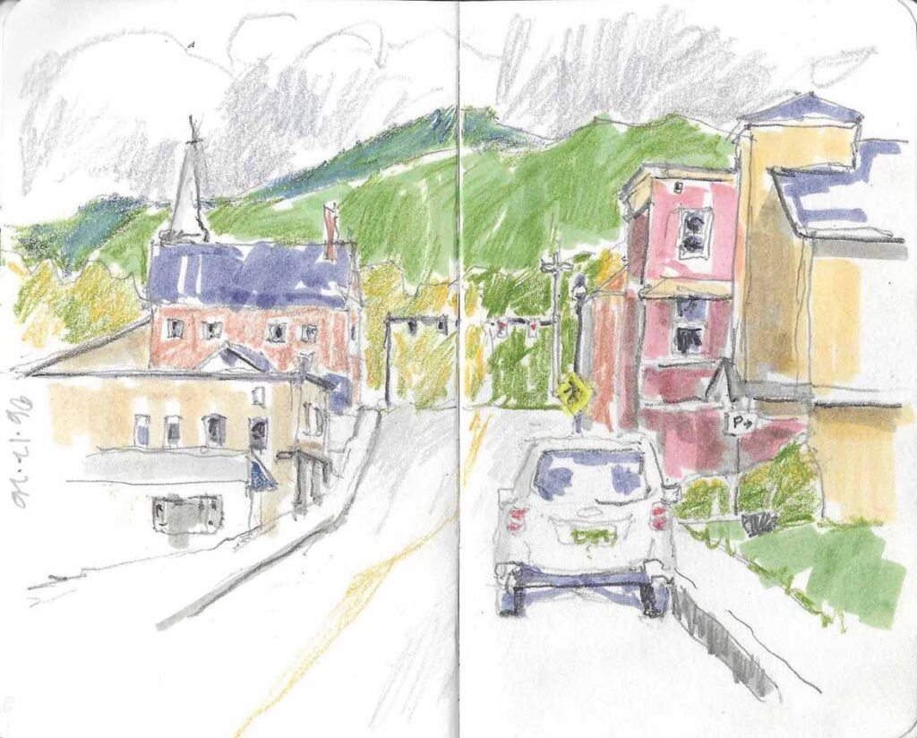
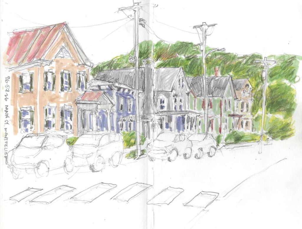
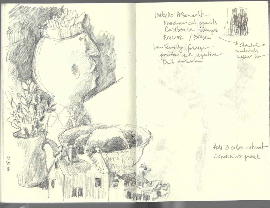
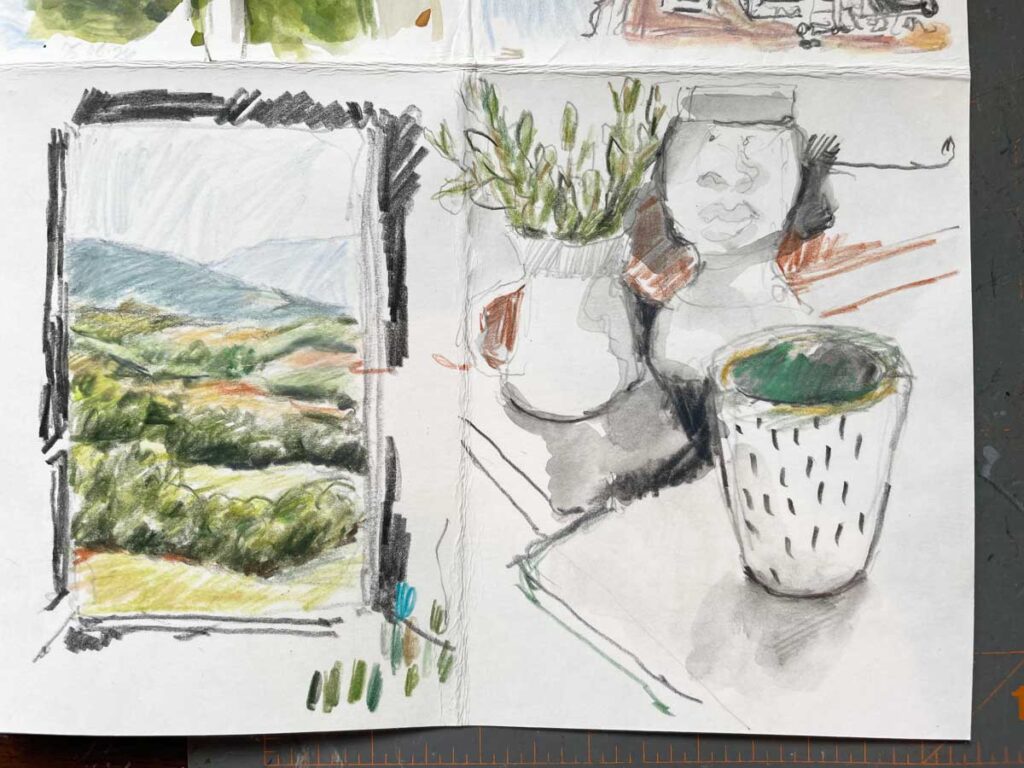
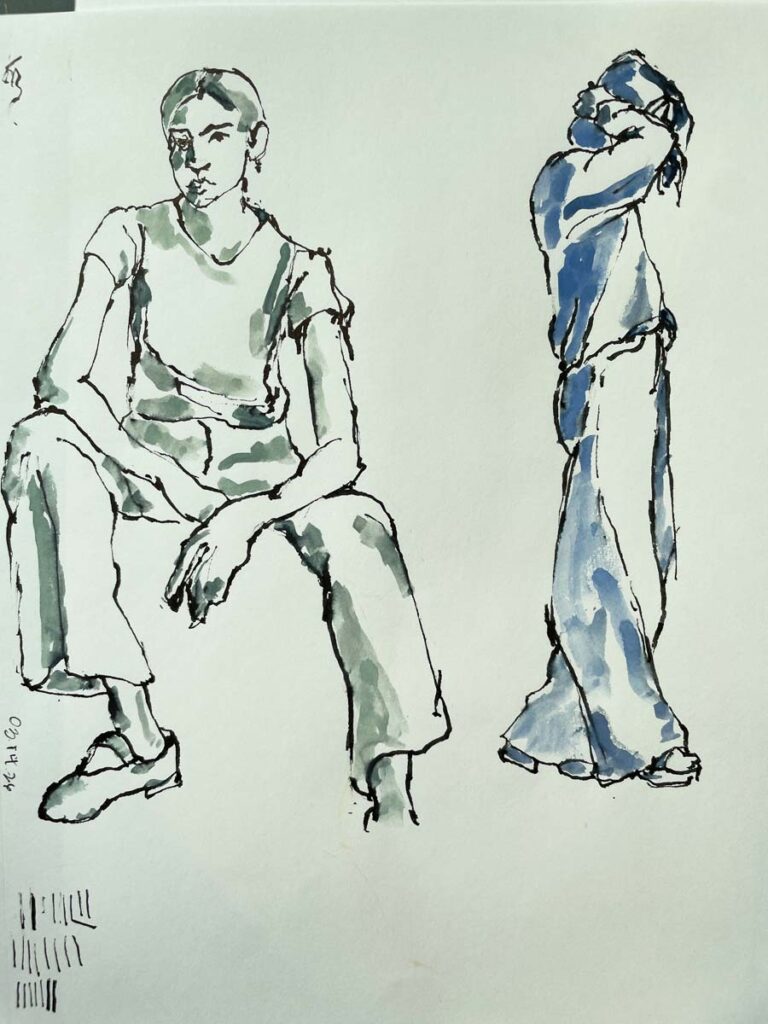
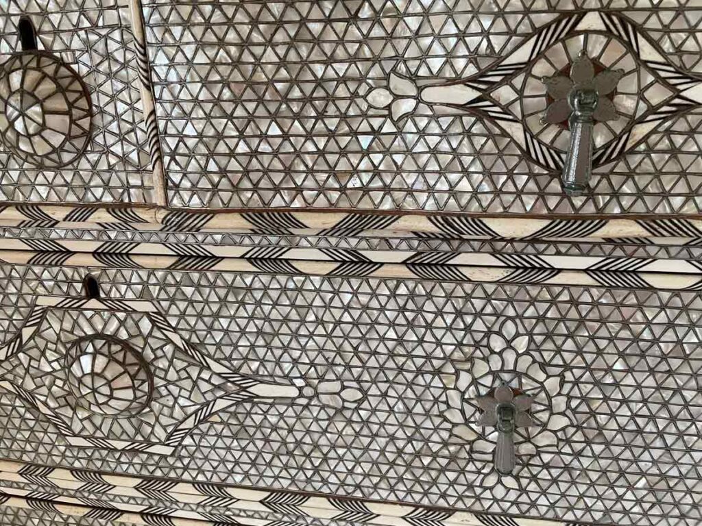
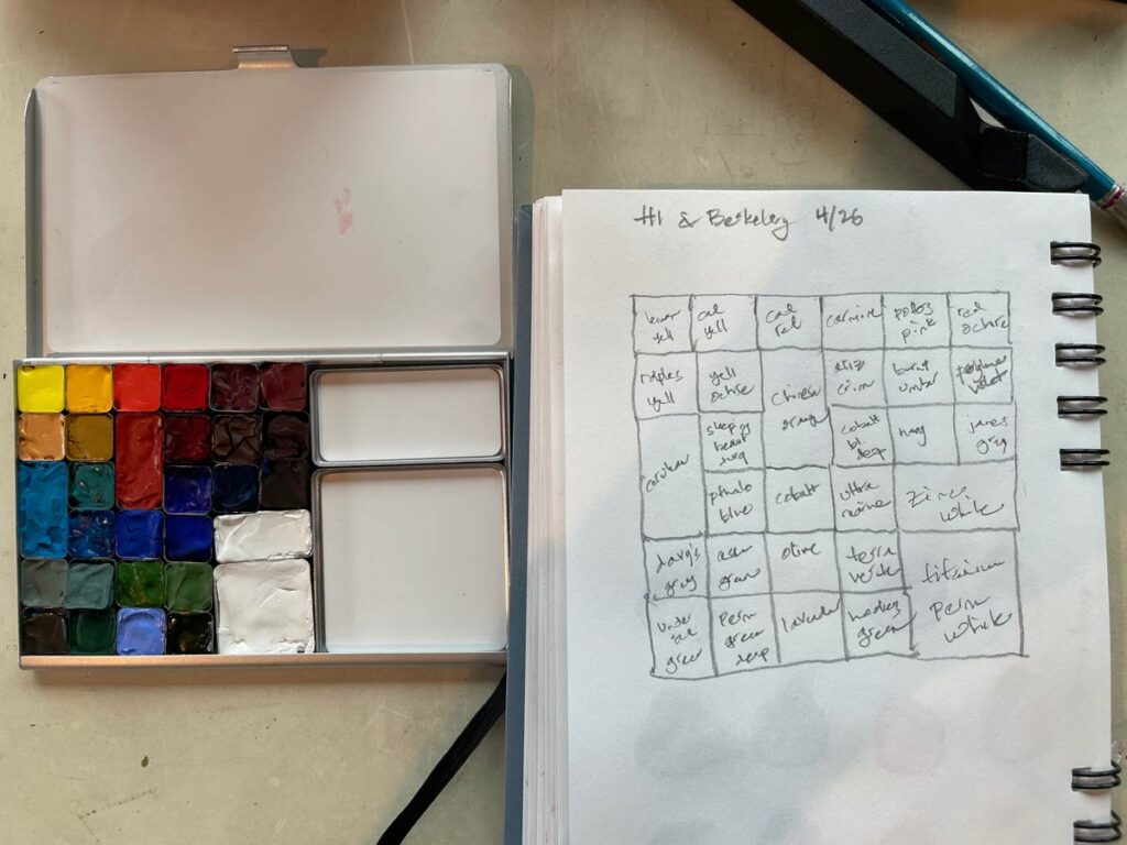
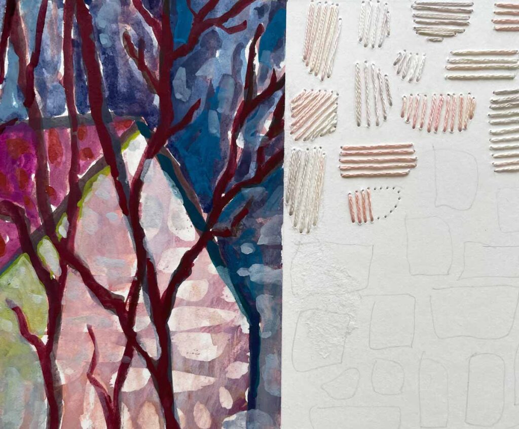
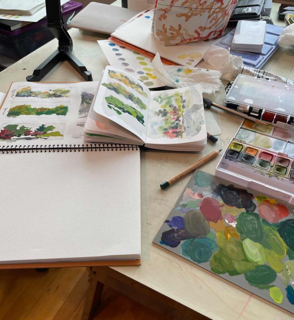
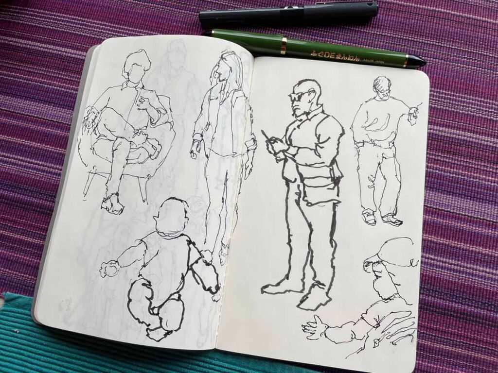
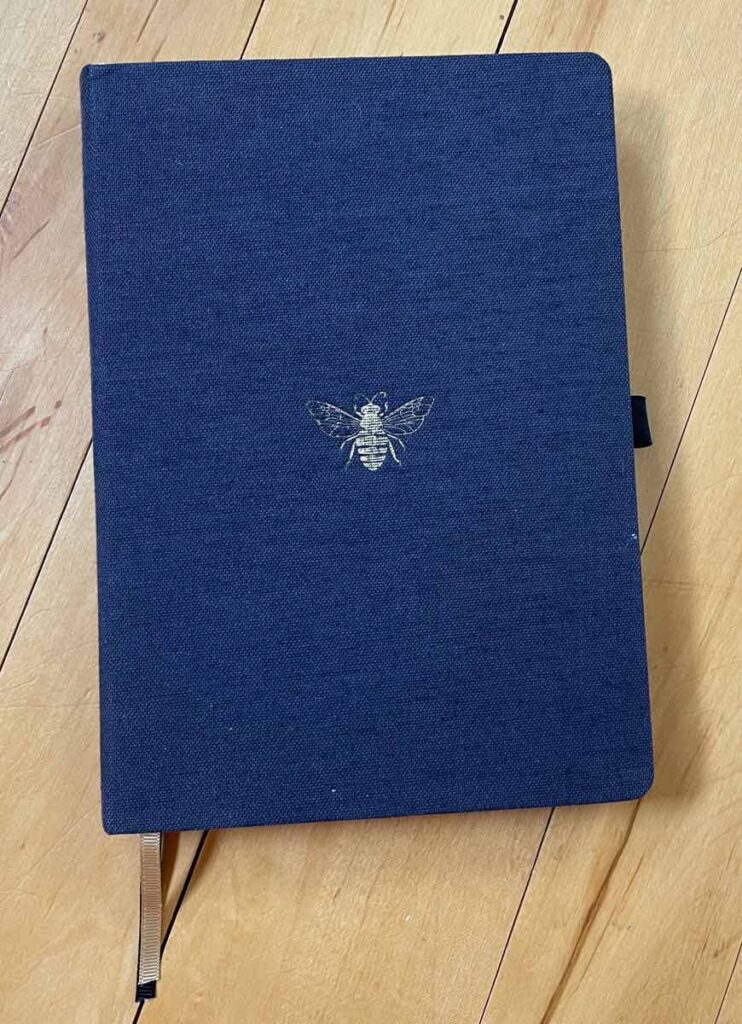
My sketchbooks, of course, and this indispensable Dingbats notebook (one of several I’ve filled) serve as my “cardboard boxes”. Years-worth of ideas and notes fill their pages, ripe for the picking.
So, keep the work you gave up on ages ago. Who knows what secrets it may hold.
I’m hatching something new right now that has me scratching my head; I have no idea yet how to bring it to life. But with all this in mind, it looks like it’s time to consult with Earlier Me to see what she may have up her sleeve.
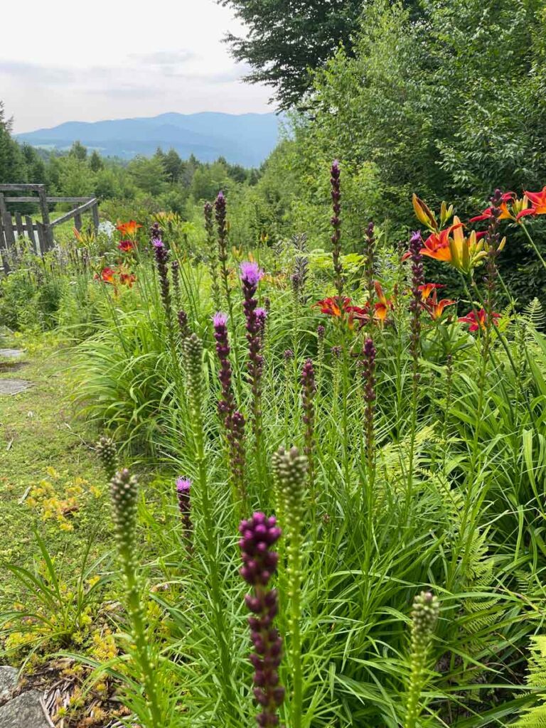
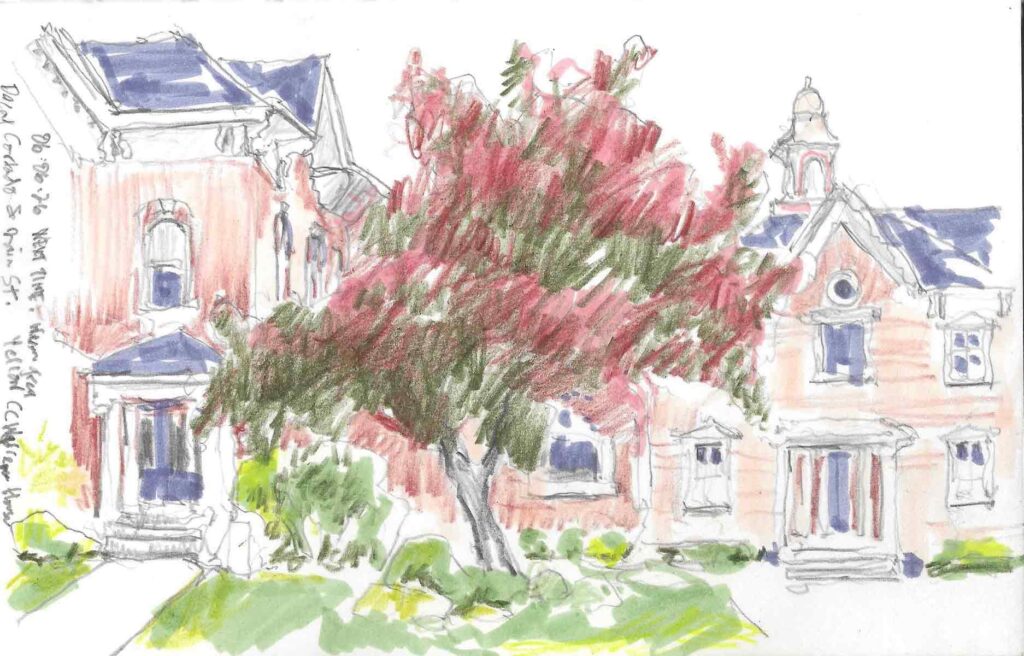
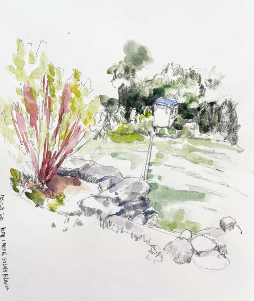
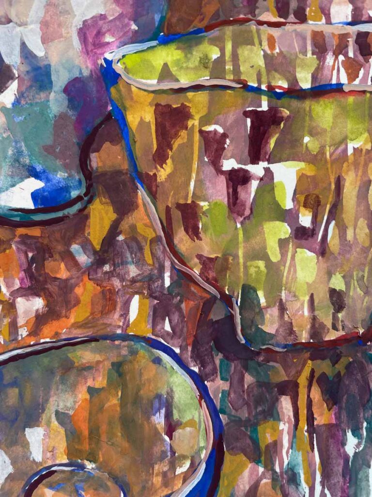
It’s just a hair early to catch the full impact of the color that will soon appear. By next week this slope will be awash in bright red-orange and purple.